Sorry for the lack of recent updates, it doesn't mean that nothing has happened - it's more the other way round:
There was so much work to do that I didn't have time to sum it all up.
Right now, I'm sitting in the plane to Marseille to visit the RMLL. fantomid will pick me up at the airport and since I got my Pandora with me (no Pyra yet ), I can use the time to type up a blog entry while listening to SNES music
So, here goes...
1. The case
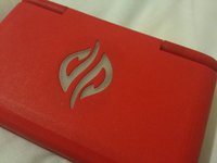
I've received the latest version of the case including the logo in the lid as well as a first version of the shoulder buttons.
In case you wonder why the color is red:
The colors used for the prototype cases have nothing to do with the final color.
I've simply decided to use a different color for each case revision, so that I instantly know which revision the printed case part is.
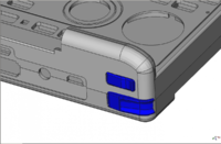
The shoulder buttons work fine physically, but I want to change the design to be more comfortable and easier to use.
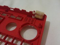
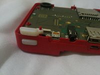
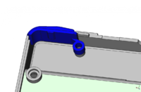
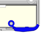
The lower buttons should go around the corner and and have a small slide where you can rest your fingers in.
The upper buttons should have a small (smooth) lip which should make it easier to feel and press them.
I've made some small models using FreeCAD how I can imagine them and sent them to the designers.
It's pretty ugly, but it's just meant to be a small dummy to show the way I'd like to have them - the designers job will be to make them look and feel good (... and I've never done any CAD before )
)
The logo is a bit too big in my opinion, but that's not a complicated change.
I want the logo to be as invisible as possible (except for when the LED is on, of course).

Together with Nikolaus, I'm working on some other changes that need to be done. We've now entered the stage where a lot of tweaking has to happen on both sides - the case and the PCB - to make sure everything fits, works and is sturdy. We don't want microvias on the main PCB (would increase the costs to make it a lot), so every mm space we can secure for the PCB helps.
We're also still looking for a better hinge solution, but no news on that yet.
Apart from that, the case is basically finished (well, LCD and Battery area have to be finished, as we've not yet decided on the battery and LCD to use).
2. The keymat
The keymat will be totally different compared to the Pandora one.
The Pandora has a rubber keymat with silk and an epoxy blob on top.
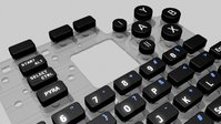
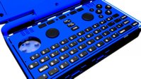
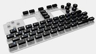
Pyras keymat will consist of a transparent silicone with black plastic keys glued on top.
The plastic keys will be produced with they're own mold, so they can freely be designed to be similar to laptop keys.
The labels will be transparent and get an LED backlight (which can be dimmed to any brightness).
The carbon pads will get some small pegs around them which ensures that keys don't wobble but move straight down.
I should get a prototype keymat soon (hopefully before GamesCom in August) which consists only of a small area of keys (Space and the keys surrounding it) which will be cheaper but good enough for testing the look and feel.
Attached are a few picture showing how it basically will look like (please ignore that the keycaps are flat here ))
))
3. The LCDs
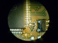
Nikolaus had a small error in the wiring for the Solomon chip, but already fixed it: two traces were switched. A trivial fix - except for that everything is pretty small.
Here is a microscopic view of the fix. The wires you see are about 1,5 times as thick as a normal human hair... so yep, it's pretty small!
The Solomon rotator chip is now up and working. Registers can be read, it reacts to all test commands as it should, so the next step it getting the displays to work.
We've got the information we need, but it's still a lot of work to browse thruogh the different datasheets and find the stuff you need to code the driver.
As Nikolaus is currently working on finishing the layout for the main PCB (urgently needed to finish the case design), this has been on hold for a few days.
But hopefully next week he'll find the time to work on that and get some results.
4. The Battery
Well, I'm still waiting for the new sample from China (why is it that these companies always need months to send out a sample...?), but I'll receive another battery next week from a different company.
Same size as Pandoras one, but 1cm thick... ouch. Will probably be too thick for us to use, but I've decided to send it to the designers anyways. Maybe it can be made to fit somehow with thinner plastic or the battery cover integrated into the battery.
I'll let you know as soon as I've got any news.
5. Registration, GamesCom and other stuff
I finally found the time to register the Pyra name and logo (was about time!)
Next big thing for me to plan for is the GamesCom in August.
Besides the Pandora, Everdrives and Retrohardware (like the RetroN5 or homebrew carts for NES), I'll also have the Pyra there.
Time is narrow, so I'm not sure what we can show there.
Of course, at least the same setup we had at the FOSDEM. But hopefully, we'll manage to get a cased one with just one cable connected to the EVM. That would be pretty close to the real thing.
As I'll only have one prototype there, I'll probably have a restricted area there where interested visitors can come in and play around in small groups while others can see at a monitor what's happening there.
I'm also preparing some Pyra merchandise. T-Shirts, the logo as pendant for a chain, etc.
If you got any other ideas for merchandise, let me know.
I will sell them at the DragonBox shop, and of course they'll also help financing the Pyra.
Well, I think that's all the important stuff that has happened.
If you got any further questions, feel free to ask here
There was so much work to do that I didn't have time to sum it all up.
Right now, I'm sitting in the plane to Marseille to visit the RMLL. fantomid will pick me up at the airport and since I got my Pandora with me (no Pyra yet
So, here goes...
1. The case
I've received the latest version of the case including the logo in the lid as well as a first version of the shoulder buttons.
In case you wonder why the color is red:
The colors used for the prototype cases have nothing to do with the final color.
I've simply decided to use a different color for each case revision, so that I instantly know which revision the printed case part is.
The shoulder buttons work fine physically, but I want to change the design to be more comfortable and easier to use.


The lower buttons should go around the corner and and have a small slide where you can rest your fingers in.
The upper buttons should have a small (smooth) lip which should make it easier to feel and press them.
I've made some small models using FreeCAD how I can imagine them and sent them to the designers.
It's pretty ugly, but it's just meant to be a small dummy to show the way I'd like to have them - the designers job will be to make them look and feel good (... and I've never done any CAD before


The logo is a bit too big in my opinion, but that's not a complicated change.
I want the logo to be as invisible as possible (except for when the LED is on, of course).


Together with Nikolaus, I'm working on some other changes that need to be done. We've now entered the stage where a lot of tweaking has to happen on both sides - the case and the PCB - to make sure everything fits, works and is sturdy. We don't want microvias on the main PCB (would increase the costs to make it a lot), so every mm space we can secure for the PCB helps.
We're also still looking for a better hinge solution, but no news on that yet.
Apart from that, the case is basically finished (well, LCD and Battery area have to be finished, as we've not yet decided on the battery and LCD to use).
2. The keymat
The keymat will be totally different compared to the Pandora one.
The Pandora has a rubber keymat with silk and an epoxy blob on top.
Pyras keymat will consist of a transparent silicone with black plastic keys glued on top.
The plastic keys will be produced with they're own mold, so they can freely be designed to be similar to laptop keys.
The labels will be transparent and get an LED backlight (which can be dimmed to any brightness).
The carbon pads will get some small pegs around them which ensures that keys don't wobble but move straight down.
I should get a prototype keymat soon (hopefully before GamesCom in August) which consists only of a small area of keys (Space and the keys surrounding it) which will be cheaper but good enough for testing the look and feel.
Attached are a few picture showing how it basically will look like (please ignore that the keycaps are flat here


3. The LCDs
Nikolaus had a small error in the wiring for the Solomon chip, but already fixed it: two traces were switched. A trivial fix - except for that everything is pretty small.
Here is a microscopic view of the fix. The wires you see are about 1,5 times as thick as a normal human hair... so yep, it's pretty small!

The Solomon rotator chip is now up and working. Registers can be read, it reacts to all test commands as it should, so the next step it getting the displays to work.
We've got the information we need, but it's still a lot of work to browse thruogh the different datasheets and find the stuff you need to code the driver.
As Nikolaus is currently working on finishing the layout for the main PCB (urgently needed to finish the case design), this has been on hold for a few days.
But hopefully next week he'll find the time to work on that and get some results.
4. The Battery
Well, I'm still waiting for the new sample from China (why is it that these companies always need months to send out a sample...?), but I'll receive another battery next week from a different company.
Same size as Pandoras one, but 1cm thick... ouch. Will probably be too thick for us to use, but I've decided to send it to the designers anyways. Maybe it can be made to fit somehow with thinner plastic or the battery cover integrated into the battery.
I'll let you know as soon as I've got any news.
5. Registration, GamesCom and other stuff
I finally found the time to register the Pyra name and logo (was about time!)
Next big thing for me to plan for is the GamesCom in August.
Besides the Pandora, Everdrives and Retrohardware (like the RetroN5 or homebrew carts for NES), I'll also have the Pyra there.
Time is narrow, so I'm not sure what we can show there.
Of course, at least the same setup we had at the FOSDEM. But hopefully, we'll manage to get a cased one with just one cable connected to the EVM. That would be pretty close to the real thing.
As I'll only have one prototype there, I'll probably have a restricted area there where interested visitors can come in and play around in small groups while others can see at a monitor what's happening there.
I'm also preparing some Pyra merchandise. T-Shirts, the logo as pendant for a chain, etc.
If you got any other ideas for merchandise, let me know.
I will sell them at the DragonBox shop, and of course they'll also help financing the Pyra.
Well, I think that's all the important stuff that has happened.
If you got any further questions, feel free to ask here


