Pangea - Alternative Gui To Gmenu


efegea

Active Member
Joined
Aug 8, 2005
Messages
636
Age
38
Location
GP32Spain, Spain
Warning: This is a Work in progress, it's not finished

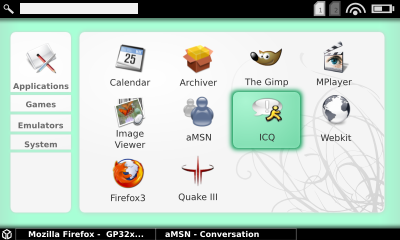
This is a work-in-progress of my alternative interface. It currently features a XML skins system, very configurable (positions, colours, fonts, sizes, text..all is configurable) and there are a few very interesting features to come.

It's name is Pangea.

Pangea it's the spanish translaction of Pangaea, the name of when the continents were united. But it's also the combination of Pandora and efegea!

Video is sluggish because xvidcap were eating are my cpu cicles.

http://www.youtube.com/watch?v=kdcwlHdkJ8A

Here is a mockup of what I intend to get, more or less.. But it's fully configurable, so anyone can write his own skin.
pandoradashboardmockup0fu1.png
 
Last edited by a moderator:
That's great!
Having the menu on the left side is similar to Maemo, if you get rid of the description and only use icons in the menu it would be perfect. I like it and will try it on my Pandora :)

Beautiful, thank you! :D
 
Yes thank you. I can't seem to watch youtube vids on this pc without risking the blue screen, so I'll view that tomorrow. It looks nice in the pic.

It's good that we are getting lots of development and ideas to look at now from several sources. This is what is really exciting.
 
I like it. So long as it can be controlled with the cursor keys, and not solely by mouse/touchscreen. Looks a lot nicer than GMenu, IMHO

mali said:
...if you get rid of the description and only use icons in the menu it would be perfect...
Oh no... why would you want to do that?! :eek:
 
Last edited by a moderator:
I really ike the interface and think that it has great potential to be both great-looking and useful, although I'm not sure how useful the grab-and-drag method used to scroll the menu down would be on the Pandora.

I assume it will be mapped to one of the key, or the direction pad perhaps?
 
That's pretty rockin efegea.

I like the fact that the theme itself pretties up the icons. The only fault I know of with Gmenu2x (well not really a fault), is that if you use an icon set other than the default one, any new programs also need an icon making in the same style or they look out of place. It's so much easier if you can just use normal icons for everything and the theme makes them look the same as all the others automatically :)

Good look with this and thanks for sharing your progress with us all.

p.s +1 for joypad/stick and button control
 
Pleng said:
mali said:
...if you get rid of the description and only use icons in the menu it would be perfect...
Oh no... why would you want to do that?! :eek:

If there is an icon, for example looking like a joystick, I know that it means "Games". I like well made icons more than just plain text and icon+text would be redundant. Plus the menu-bar can be smaller, leaving more screen space for the main window(I'm just refering to the menu on the left, and not the icons+text in the main window on the right, which should be icon+text of course). The menu will only contain a limited number of entries, so there won't be confusion, what a certain icon refers to.

Edit:
I've got an idea. It would be really cool, if the GUI automatically assigns F-keys to the different tasks and displays them in the taskbar, so that you could switch tasks by pressing the according F-key.

Edit2:
You could assign menu selection to the directional up and down buttons, app selection to abxy, tasks to F-keys like I wrote above, one of the analogs as a mouse replacement and the other for scrolling. That would be pretty intuitive and very efficient. ESC-key could switch back to GUI while in Task-mode.
 
Last edited by a moderator:
hey

I really like this also, nice work!

I think it would rock if you could change all the green/aqua sorta color on the fly (maybe with a slider or something) to whatever color ya want :). Hmm, or have it pulse/morph slowly between two different colors or something, where the colors are quite close to each other, such as blue into blue/purple color.

cyas
 
Do you prefer this background? It have been made by Zenzuke http://www.zenzuke.com/

Please forgive the application icons, are randomly created by me, inspired by the icons I found on my harddisk and the web :lol: (lol netscape)

pandora004rq5.png
 
mali said:
If there is an icon, for example looking like a joystick, I know that it means "Games". I like well made icons more than just plain text and icon+text would be redundant.

I've always preferred text-and-icon, myself. Less chance of other people asking "how do I get to..." when I'm letting them play with Pandy.

Anyway, with a bit of luck we should both get our way, as the OP has stated that:

QUOTE

It currently features a XML skins system, very configurable (positions, colours, fonts, sizes, text..all is configurable)
 
Last edited by a moderator:
Looks very nice, I like every design choice you've made here. I like how only the icon for the opened category is displayed in order to save space, and the icons's size should be just right for Pandora's hi-res screen. The status bars are simple and unobtrusive, really good work here efegea :)
 
Quick question, what happens hen you have more than twelve apps in a section? Are you planning on arrow type navigation for forward and back?
 
TaG said:
Quick question, what happens hen you have more than twelve apps in a section? Are you planning on arrow type navigation for forward and back?
That's what you are missing by been unable to view the video :lol:

It has iphone-like kinetic scrolling. I'll add a configuration option for the user to choose top to bottom or left to right scrolling. You can scroll by using d-pad or touchscreen.
 
Last edited by a moderator:
you think this will run faster if you implemented the 3D chip with it?(yes I know the driver is not out yet, but I mean in the future)
 
Yes, much faster and smoother with OpenGL ES acceleration. Qt 4.5 will have a driver for the OMAP, so when it and the imgtech driver are released, it will run much better.
 
This is a major reason why I've been looking at moving the battery, clock speed, etc, functionality into Matchbox widgets instead. So that we can have these things as well as Pandora hotkeys pervasively across the different GUIs that a user might want.

I'd just request that the window be dynamically resizable according to WM parameters rater than fixed to 800x480. This will let the window manager shrink the window slightly, to make room for the panel applets.
 
Back
Top