Pyra Website Design Ideas


Dresha

Member
Joined
Jan 26, 2012
Messages
35
Age
44
Location
Germany
Hi everybody!

The design of the website is the first step. Therefore we need your design ideas! ^-^

SO paste your visual ideas here and keep the following guidelines in mind!

Design Guidelines

  • Everybody who submits a design please keep in mind we want to make a responsbile page.
  • Please submit THREE Versions of your Design. 1. PC, 2. Landscape and 3. Portraitmode.
  • Don't go to much in details. These designs should define the outline for the webpage. As we will need to make design details for each content part of the page seperately.
  • The Page will mostly be informativ.
  • Only placeholderboxes.
Please only discuss the posted designs and NOT the content here.
 
So you start with the designs and not the contents?
Of course.

It will make use of a content management system. Content will grow over time, be added, changed and removed.

The menu structure might even change completely.

But it should look good from the very beginning, regardless what content we'll have.
 
(SITE Ѧ ) ( IRC ߝ) (FORUM ֏) (NEWS Ҩ) (WIKI ߐ) (REPO উ) (↓
EN.gif
Germany_flag_gif_25x17.gif
icon_flag_france.gif
flag-en_JP.jpg
lang_nl.jpg
)

/handheldpc
← Xfce desktop with wallpaper| Midori | packagemanager | ED video about project →
imagesred.jpeg

███ ███ ███ →

photo.jpg
( + ) ↓ 
secure.png
linux10.gif
 
community-icon.png
RTEmagicC_LOGO_made-in-germany_01.jpg.jpg
700 €.-
shopping_cart_green.gif


-----------------------------------------------------------------------------------------------------------------------------------------------
/games #(Focalpoints glowing buttoncluster dpad and nubs L R L2 R2. stylized black and white pyra)
← moon's moon | reicast | nubnubs | glxgears →
2648f58f1122007fdfa3a59ce7bd6211_large.gif
images.jpeg
( + ) ↓ Enjoy games as we do, with us. Old systems and modern games alike.
<play a game jingle>
-----------------------------------------------------------------------------------------------------------------------------------------------
/photography #(Focalpoints: screen, SD slots, e-sata)
← wbviewer | darkroom |gimp | pitivi →
leica-t-(type-701)-silver-18181-200px-200px.jpg
images.jpeg
( + ) ↓ On the fly, in the field. Your workflow isnt limited nor inhibited.
< animation of camera plugging into usb or sneakernetting sd-card or all sd cards going in and out>
-----------------------------------------------------------------------------------------------------------------------------------------------
/audiophile # Focalpoints: audio/mic jack volumewheel L ▶/= R █ L2 ▶▶| R2 ▶▶|
← Ex falso | VLC | cmus | audacity →
 
HS300.jpg
images.jpeg
( + ) ↓ Orchestrated fidelity. TI DAC and Amplifier stage.
<play a orchestra jingle>
-----------------------------------------------------------------------------------------------------------------------------------------------
/expandedview # ala http://steelseries.com/products/mice/steelseries-rivalclick on each item to see specs about it, or show all to see all text


51021-ev1.gif↷↹ 
images.jpeg


Block-schematic of the whole circuit.

( + The fewer adaptors you need while on the go, the better, one tiny microusb cable supplied which can also be used for charging)

SPECS.
< click to show small info on each>

3D
print.png
CE-Logo.jpg
rohs-logo.jpg
recycle.png
cs_jack_phono.gif
icon_CGPLapps.png


# Explanation of above:

↶↷ spins something around
←→ swaps what is on the screen
( + ) expandable informationbubble
↓ indicates a dropdown menu
<> click to trigger something
# comment

One section for each use. Easy to point different people to, and also works as pleasant into to the pyra.
The main idea is to really focus on what this is, and what it can be, that people are interested in and understand.
It gives the user a sense of what the device does, as if you are using it, which is to get as close to metal demo as you can. Presenting the actual device.

Caters to different types of users, which means more markets, the user can press arrow down to get to the next section so as to get the full tour or skip a page.

Instead of walltexting the user, this is a very easy informationflow. The top bar you bring along with you.

There is no text per default because text sucks, the user doesnt suck, so there is no explaining things the user understands visually, like how there is a full keyboard.
The alt img tag is for explaining the picture, in case the user is blind, so thats what that does.

A lot of projects get mentioned, which brings their userbase to us, and we give back to them. :) As for which projects that could be, join discussion here

Code:
Make CSS fields
Floating javascript menu
Html5 glue

Graphics:

Real images
Stylized pyra image
colour decisions, background colour for each minipage, colourpicker (has to correspond with case colours available)
Case design files or multiple angle photos→ dynamic svg images for pyra that rotates
Images of every part for expanded view.
Purchase button
Icons for every entry
screenshots for every entry
icons for every section
Camera pictogram
Headphones pictogram
Infobubble icon
Rotation arrows.
Icon indicating there is a page below
Flags for language

Text:
Work on infobubbles
Set up translations

Music: Game jingle loop, orchestra loop
Html5 animations: Nice for the tiniest bit of functional eye-candy.

Video: Ideas needed, help present ED and the community.
webgl: Nice for expanded view

Fallback to static everything scrollbar with jpegers.

IRC: live chatroom with explanation of asking questions
Forum: Hopefully change to discourse
News: Hopefully change to status.net or pump.io microblog, ED-posts, newsposts
Wiki: Update to 1.22 mediawiki, pyra section
Repo: Include show debian packages here and in packagemanager
Git integration found here as well

Something for everyone.

Edit: https://github.com/erming/shouthttps://dl.dropboxusercontent.com/u/736509/shout-irc-screenshot.png would be nice for the IRC page
 
Last edited by a moderator:
So you start with the designs and not the contents?
I know you shouldn't start a design without content. But we have the whole current Pandora webpage so we have enough example content for designers to use. ^-^
 
So you start with the designs and not the contents?
I know you shouldn't start a design without content. But we have the whole current Pandora webpage so we have enough example content for designers to use. ^-^
I'd argue that the current Pandora page is probably not optimal to start things, because it was not created in good conditions in the first place either. There's too much it tries to communicate at once. 

That's how I would design a new site:

- first know who you want to talk to - who are your customers/clients and what they are looking for if they are interested in the Pyra. 

- first discuss what is the message you want to give to them. 

- decide what is the absolute minimum information that should be there on the landing page - and how it should be phrased to attract them. 

- then you can start working on the structure needed to access additional information

Working on the design first is taking things backward. Design = Execution. You don't start the Execution until you have a concept and a message to transmit. But I guess it's up to you. 
 
Last edited by a moderator:
I would partially agree with the design for now. Since we still don't know, what we'll deal with (Framework, CMS, ...) I would recommend a design Mock-up. With that Mock-up the Dev-Team will be able to discuss the system we're going to use. It's pretty important to know the basic features the page will have, for example a wiki, side-chat, ordering page, it's own community-hub, and so on...
 
The features it will have and what are nearly fix by now:
 

IP Content as a CMS that holds everythin together

IP Board as a Forum
Mediawiki as a wiki
 

BUT we want an outlight at the moment and not a Design for the whole site.  At the Moment it is more which colors do we want. What Ideas do you as a community have with the website. And those are independend from the Content System and content. I'm aware that we need the content and the outline when we want to go indepth.

But acutall it is really a Playground to get coloring of the page and ideas from you. As a creative brain stroming.
 
Last edited by a moderator:
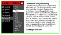
Some ideas:

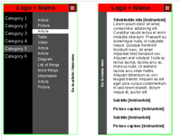
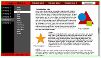
pyrawebsiteidea4-landscape.pngpyrawebsiteidea3-portrait.pngpyrawebsiteidea2-desktop.png

The colours are probably suitable, although graphical style would need fine-tuning.

  • Short (top-to-bottom) screens turn the top bar and the footer bar into a menu button. and make subsections of articles hidable
  • Narrow (sideways) screens result in either the article, or the menu being visible, but not both, with a button to choose between them
related sites would be forum, repo, wiki etc
 
Last edited by a moderator:
Vaisala.com port 80


...what's this, when I hop into this thread I get a login prompt for it?


...amivirused?
 
Vaisala.com port 80

...what's this, when I hop into this thread I get a login prompt for it?

...amivirused?
Don't know, but I see that the page is trying to load content from about 20 different servers from which it usually doesn't load content (all blocked, I didn't see that login prompt either, but I see that it would try to load something from vaisala.com if I allowed it).
 
Last edited by a moderator:
Ok thanks.. strange eh. Only this thread that it shows up for, every time though
 
Modern browsers do scaling. There shouldnt be more shown than a basic picture and the introtext, which you can view in any orientation and from a distance.

Like someone said, if i cant show it on my cellphone to someone, its not good.

Then the textboxinfo could be fit-to-width after the image and text

Silliest product in the known universe, fantastic infographic http://www.dx.com/p/gqd-kie-001-stainless-steel-kiwi-slicer-cutter-rind-removal-tool-silver-316002

I think for background we should use relaxed uniform black and white photographs. Each alluding to the page they represent, but also carrying a thematic similarity in style.

The visuals which we cant to show then, become the centre-piece.

Like http://lumigon.com/ only with info that means something. lumigonsite is a bit too impersonal, and moreso subliminal. We want to actively make someone think they are using it and having fun, which is what its about. Condense that whole tour into each one of the slides for every slide.

Transparant top menu was good.
The left side menu could be little pictograms of each thing to let you know there are more things and where you are.

[pyrapictogram]         O
[8bit gamecoin/block] O
[camera]                   O
[note/headphones]     O
[nut and bolt]             O
 
Last edited by a moderator:
Modern browsers do scaling. There shouldnt be more shown than a basic picture and the introtext, which you can view in any orientation and from a distance.

Like someone said, if i cant show it on my cellphone to someone, its not good.

Then the textboxinfo could be fit-to-width after the image and text
 You can use CSS to modify the appearance based on the available screen area. I'm not in favor of making sites minimalistic for all users just because some of them are using a phone for browsing. In general a page should have at least three styles: one for regular browsing, one for mobile browsing, and one for printing. The HTML should be simple and deal only with the content, and the CSS should give it a layout that is appropriate for the viewing medium.
If you're going to do a 'mobile' version of the website - be sure to include a link on the mobile site to switch to a 'desktop version'. With many of today's high resolution mobile devices (Pyra, Phablets), the desktop version may actually be the preferred experience.
 
Modern browsers do scaling. There shouldnt be more shown than a basic picture and the introtext, which you can view in any orientation and from a distance.


Like someone said, if i cant show it on my cellphone to someone, its not good.


Then the textboxinfo could be fit-to-width after the image and text
 
You can use CSS to modify the appearance based on the available screen area. I'm not in favor of making sites minimalistic for all users just because some of them are using a phone for browsing. In general a page should have at least three styles: one for regular browsing, one for mobile browsing, and one for printing. The HTML should be simple and deal only with the content, and the CSS should give it a layout that is appropriate for the viewing medium.
If you're going to do a 'mobile' version of the website - be sure to include a link on the mobile site to switch to a 'desktop version'. With many of today's high resolution mobile devices (Pyra, Phablets), the desktop version may actually be the preferred experience.
I don't think it's a good idea to do a separate mobile version. Just use CSS to make things look differently (more compact, less decorated) when viewed at a lower resolution. That also benefits desktop users who want to have a non-maximized browser window that still shows useful stuff without needing to scroll in all four directions all of the time.
 
With many of today's high resolution mobile devices (Pyra, Phablets), the desktop version may actually be the preferred experience.
I have a 1080p resolution phone (Sony Xperia Z) and I prefer to use the mobile version of a website because I find it much easier to see the text, there's less scrolling involved and also it reduces your data usage.
 
Minimalism is good. Minimalism is a goal. Anything else takes away from _the point_, which is a good one to make, that we are trying to deliver.

Filling up half the screen with borders and menus, is bad. I want the scroll indicator to show me where i am, i want the section im at on the top to be highlighted.

After im done scrolling, i want that to move out of the way, casually vanish, or stay transparent.  Because my feeble mind needs to be on the details.

And while lumigons site has its obvious flaws, much like the current pandora one. I'd take the lumigon one every time. Because it has a message. Because it delivers on that message.

Sending mixed messages is even worse than sending too much information.  So if my approach above is limited, what would you add to alleviate it, what does it _need_?

Im confident there isnt anything that _isnt_ needed, so thats good. Meanwhile it is about _the message_.  And quite clearly presenting a device mimicking how you would present its features in a live presentation, is a whole lot better than the average website. Especially the ones we have. And especially the wiki. Because for however much the wiki is lacking there, it is good at being a wiki. Use it for that.

As for colourscheme, gray black and white, are good colours. Red draws attention, so it should be used for active content.
 
Last edited by a moderator:
I disagree.

Concision is good, minimalism is not.

The purpose of the website is to convey information. So there should be information. As much information as the user could possibly want.

This information should be uncluttered and carefully organised. - This is not the same as filling the screen with empty space or huge pictures.

Also, all text should be handled as a string of characters, not a pre-rendered image
 
Last edited by a moderator:
Can somebody explain to me WHY IN THE FLAMING HELL does an Open Source software/hardware project like this run its website on paid proprietary forum and CMS platforms!?!?
 
Back
Top