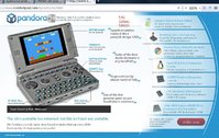
Release New Website 1.0


People use Opera? Mind blown.
Since Firefox STILL doesn't have the extraordinary "match website to screen width" button, I use Opera, yes. :D Most important button since browsers were invented imho and I really miss this on Firefox, would be so handy on the Pandora if you could re-arrange Websites to fit perfectly the screen width (since firefox useres doesn't even know what this is: it has NOTHING to do with zooming! ). But I'm dreaming, of course. ^^

I'm an Opera user too (and very fanatic, after 3 year of use), I was a Firefox user from the beta version, but version 2 was slower, so I stepped to Chrome, but was without functionality... so I went again to firefox 3... slower than ever... but then I tried Opera, and WTF !! Faster then Chrome and with a lot of functions that even firefox can't match (at least without hundreds of plugins), and has all configuration files editable...


I also used the LAST version of Opera on a Pentium 100 Mhz with 16 mb RAM with Windows 98SE... it is so badass that was even faster than ie 6 !!


The only drawback is the NOT OpenSource thing... I hope one day to see it on the Pandora ...


Anyway, I don't see issues on the site, seems ok now
 
I still have trouble with some browser defined font sizes, I've checked my fonts but it looks OK there I reduced all of their standard sizes but no effect so far. I have this problem on other Websites that don't use their own font sizes.

I've never liked "em" font sizes, and tend to work in pixels. Not entirely sure why I used "em" here, as it's a fixed-size design and most browsers these days will scale the whole site rather than just the text size ( which was never really a good idea )
 
That degrade version is a lot nice to use without JS, although on my netbook the quotes still overlap the menu.


Edit: Although the anchors could do with being closer to the headers IMO.
 
Last edited by a moderator:
[OT] I thought I will make an Australian Pandora shop ← here is my scrawny shopfront!


Now I should go and read Business for Dummies 101, or what like that.


In other news, if I ever sell one of these I promise to write a new and better game for Pandora right away :p
 
Last edited by a moderator:
Displays correctly for me in opera, just takes a while until the page is built up completely, like 5 seconds. The slideshow thing quickly runs through once before the pandora is displayed.
 
5 seconds

Erk. I definitely need to get some asynchronous and parallelised loading in place. I've been contemplating compositing the background image with other background image, but then you get misalignment of the tiled background with the content background which is invisible to most normal people but quietly annoys me.
 
I've never liked "em" font sizes, and tend to work in pixels. Not entirely sure why I used "em" here, as it's a fixed-size design and most browsers these days will scale the whole site rather than just the text size ( which was never really a good idea )
Ah, so actualy you do code the site and not Craig?


Well, It seems there is alot of progress, thee slideshow now looks correct in Opera 12.01, very nice. :) Text in the side menu still is to big (headlines mainly) but I guess this is also not hard to fix.


Screenshot:

Zwischenablage01.jpg
 
I've never liked "em" font sizes, and tend to work in pixels. Not entirely sure why I used "em" here, as it's a fixed-size design and most browsers these days will scale the whole site rather than just the text size ( which was never really a good idea )
Ah, so actualy you do code the site and not Craig?


Well, It seems there is alot of progress, thee slideshow now looks correct in Opera 12.01, very nice. :) Text in the side menu still is to big (headlines mainly) but I guess this is also not hard to fix.


Screenshot:

Are you using Opera on Linux ? I'm on Windows and tried to play with fonts configuration, but the page is always show perfect
 
Last edited by a moderator:
Windows.


Maybe I've updated my Opera to often, I basicly have it since 2008 on my PC. :D It even uses 2 different locations to store it's configs and stuff. Maybe I should try to use the new Opera 64, which I can use in parallel to my old Opera. Since I have my entire Mail client and settings+bookmarks from ~100 years in Opera, a complete rollover to a fresh install may not be that easy.
 
Last edited by a moderator:
The site looks fine on Chrome on my desktop PC, great effort overall but I do think that some serious consideration should be given as to whether Pandora 1Ghz is a good name in terms of marketability to a wider audience. 'Pandora +' would be far better IMHO. To most tech aware users 1Ghz = meh.


From a personal perspective I think the name Pandora 1Ghz is fine and logical but if you're looking to find a wider market then a name change should be considered IMHO. Also Pandora 1Ghz is admitedly far superior to my suggestion of Pandora 1.5 in the what should it be called thread.


________________________


A few specific points / questions :


'800*480 like the Galaxy 2S' - should be S2 & is of doubtful marketing value comparing it to a phone which has already been superseded by the S3.


'We know movies, music and games chew through disk space, so we didn't put any fixed storage inside the Pandora' - er, what about the 512MB nand? Not a big deal but people will be thinking that you can't boot the Pandora without external storage which might put a few off.


It should perhaps be explained that Android for Pandora is in a beta state just in case anyone expects the 'full android experience' i.e. working bluetooth / status icons etc. An even better idea would of course be to get a fully working Android install for Pandora, though that would probably take time / money.
 
Looks 100x better than the old website as far as layout.


One thing: when you go to Emulation from the curved menu on the right


It takes you to the basic overview page but then it gives you hyperlinks on the right to the individual systems that go no where


Is that going to be fixed to take you to videos/page with the current emulators available for that system?

Yes, that's the plan once we make the videos.

The site looks fine on Chrome on my desktop PC, great effort overall but I do think that some serious consideration should be given as to whether Pandora 1Ghz is a good name in terms of marketability to a wider audience. 'Pandora +' would be far better IMHO. To most tech aware users 1Ghz = meh.


From a personal perspective I think the name Pandora 1Ghz is fine and logical but if you're looking to find a wider market then a name change should be considered IMHO. Also Pandora 1Ghz is admitedly far superior to my suggestion of Pandora 1.5 in the what should it be called thread.


________________________


A few specific points / questions :


'800*480 like the Galaxy 2S' - should be S2 & is of doubtful marketing value comparing it to a phone which has already been superseded by the S3.


'We know movies, music and games chew through disk space, so we didn't put any fixed storage inside the Pandora' - er, what about the 512MB nand? Not a big deal but people will be thinking that you can't boot the Pandora without external storage which might put a few off.


It should perhaps be explained that Android for Pandora is in a beta state just in case anyone expects the 'full android experience' i.e. working bluetooth / status icons etc. An even better idea would of course be to get a fully working Android install for Pandora, though that would probably take time / money.

I understand about the name, I've been in two minds about it for a long time.


We have gone though a few names on the temp website, first it was Pandora Edge, then Pandora+, then Pandora2X, then Pandora 1Ghz.


It's a tricky one (for the reasons you posted).
 
Looks 100x better than the old website as far as layout.


One thing: when you go to Emulation from the curved menu on the right


It takes you to the basic overview page but then it gives you hyperlinks on the right to the individual systems that go no where


Is that going to be fixed to take you to videos/page with the current emulators available for that system?

Yes, that's the plan once we make the videos.

Sounds good, like I said the new website looks a lot more elegant and professional.


Are theses going to be community video? or Video from You and ED?
 
I know it's not overly important (well, only to me), but when you list "ZX Spectrum and XXXX", could you change it to "ZX Spectrum, Amstrad CPC and XXX" - this is how I came to find out about the Pandora... from being an Amstrad CPC emulator user and wanting to find devices that run these emu's. just a suggestion, minor, but would make a big difference to me :rolleyes:


I'm also accessing the new website from a hotel in Saudi Arabia (not known for it's super fast internet speed), the animated images appear first and maybe 30 seconds later the Pandora appears - I did wonder for a while what was going on. I know most of the intended audience will be on fast broadband / fibre etc... but you might want to consider the vast majority that might not be?


My last comment would be to think about the audience you're pitching to. Is it technical people only or to general users (read that as 'XP users')? If it is to general users, then I think you have it balanced almost right.


Perhaps there should be a "technical" section / page, where you can link to all the 'how to recompile your kernel etc... info' (maybe this already exists and I missed it?)


When is the new HTML5 repo going to be available and will it be linked from this new website?
 
Last edited by a moderator:
- You should heavily reconsider the marketing statements on the new website. The "quotes" on the first page are already misleading: If they are quotes, then link to the place where such was said, if they are not, then don't make them look like they are.


- The name "Pandora 1GHZ" is a bad choice as said already. The logo is probably worth a copyright infrignment call from apple (iCloud...). Also, the logo looks just out of place there


- Integrate a hub with links to all essential things like repo, wiki, forums, firmware-git, etc. I'd consider this essential


- Please make use of resolution over, what is it, 1024x786?


- I personally don't like this new, marketing orientated design, but meh, not up to me to decide about that.


EDIT: Also takes ages to load here.
 
Last edited by a moderator:
I just saw, that the dsp prozessor is not mentioned anywhere...
 
- You should heavily reconsider the marketing statements on the new website. The "quotes" on the first page are already misleading: If they are quotes, then link to the place where such was said, if they are not, then don't make them look like they are.

Good point.

- The name "Pandora 1GHZ" is a bad choice as said already.

Probably agree in terms of marketing. The name choice was a toughie to say the least. It's pretty much called the "1Ghz Pandora" or "Pandora 1Ghz" on the forums, though, so attempting to call it anything else at this stage may also be confusing.

The logo is probably worth a copyright infrignment call from apple (iCloud...). Also, the logo looks just out of place there

Apple didn't invent aluminium, the particular look is a by-product of machining using a circular cutting head. And if Apple were going to call out people for copying iCloud it would be the thousands of people using the exact same iCloud logo... but as they stole said logo from elsewhere, I don't suspect they're likely to bother :D

- Integrate a hub with links to all essential things like repo, wiki, forums, firmware-git, etc. I'd consider this essential

You're probably right. I'm as yet unaware of how this marketing orientated website will fit alongside the much more existing-user orientated one. I think a more portal-style site with such resources is in the works as a separate entity.

- Please make use of resolution over, what is it, 1024x786?

It already expands up to 1200 pixels wide ;D
 
I also think missing/hidden community links situation sucks, makes it look like buy-it-and-be-forgotten device. There is no way to navigate to repo, official firmware updates, any kind of dev info or sources, only forums are reachable. Sure you can reach those by going to forums and then through it's bar, but things like that should be clearly on the main site IMO.


I also don't like those quotes, they look too artificial without any sources.
 
Last edited by a moderator:
Back
Top