Replacement Interface


parag0n posted on Feb 24 2006 at 02:44 PM said:
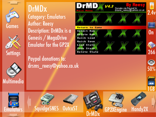
gp2xmenu1.png


This is the latest, I've added more icons to the right hand side, so it now shows the volume and the size or free space on your SC card.

also, a few more minor tweaks, fixing bits where the sizes weren't quite right, and showing the "selected icon grow" feature similar to osx's bottom bar, the selected icon will be enlarged to eb bigger than the default icons :)


Paragon why don't you take my image and pretty it up? I think the reason mine is overlooked is because it is too "rough"

If the icons were replace with the nicer ones I think it would get more attention. It is a much more efficient use of space. You CAN replace the icon pictures with icons that make more sense, like for SNES you can have a picture of a SNES for the icon. Plus you have the name of the app below the icon.

I just don't like the PSP style cross menu. Way too much scrolling to get to what you want. you have to sit there and scroll, scroll,scroll and if your item is 14 icons away you are moving 14 times to get to what you want.

I don't want to sacrifice my useability just because it may "pull people to the GP2X". We are doing this to make it more useable to us, not to be an ad.

launcher2.png
 
Last edited by a moderator:
DaveC posted on Feb 24 2006 at 04:21 PM said:
Guyfawkes posted on Feb 24 2006 at 09:30 AM said:
I like Hanz™ idea, it looks like a nice and simple design and fairly quick to use. It reminds me of the PSP interface which is pretty good itself with the vertical and horizontal navigation.
Yeah but it is just plain ugly. Not the skin but it is just a list of text. Icons are much nicer. scrolling through a list is tedious and time consuming, I HATE that in the curent menu.

Do we REALLY need to have a big picture of the program you are running taking up half of the screen? That seems to be a HUGE waste of space, I think that is a terrible idea. After you see that a few times you will get sick of seeing it all of the time, and wish you had more room to put icons for faster navigation.
Yes it is ugly as I said right a the begginning of my post, as I said we are discussing the ergonomics and interface not the quality of the skin.
What the hell are you talking about. That picture isn't the program you are running, it is an Idea parag0n had basically if you were to move the cursor over an avi it would show a snapshot of that avi, that is the idea.
Or a snapshot of an emulator. After all it is much easier to pictures are much nicer than text. I thought a good Idea would be to edit some emulators to save a png when you savestate, that would mean you would be able to see the game you played last and where you were before you got into it. Is it possible to get sick of seeing a different picture everytime, I mean do you even get bored of seeing icons on your screen?
What about the filtering system that I spoke of, is that just a waste of space too?
The Idea I proposed that the panels could be reused for different things, such as the metadata panel perhaps changing to copy,paste,delete etc... When it is needed, I think that is a pretty good Idea.
My original idea is that the panels can remove or resize themselves, whether it would turn out as I wanted I don't know.
What about my idea about filtering by file extension, and then being able to set it so that a file extension has a default application it opens with? Was this a bad idea too? You see I would consider it quite a cool feature to be able to have a menuitem on the left that says for instance Genesis Roms, and then on the bottom bar would be all of the genesis roms, and you could just open them up with the correct emulator by clicking on them?

And I don't believe you need more room for icons. The system here should be very fast. No slower than yours I would bet, and far more flashy.
 
Last edited by a moderator:
The reason i did a mockup of hanz's idea was because i liked it better ;)

I'll have a go at playing with yours later...

One thing you said, about scrolling 14 places is wrong, you'd tap R, R, R, then left on the joystick, voila, 14 spaces! basically, it takes the same number of button presses to navigate the cross style menu as it does the grid-style menu.

When i build my menu, i'll probably put both styles in to be honest, the "compact" being the davec way, and the "full" being Hanz's way.

We should work together on integrating our ideas, not play them off against each other imo ;)
 
Hanz™ posted on Feb 24 2006 at 03:42 PM said:
DaveC posted on Feb 24 2006 at 04:21 PM said:
Guyfawkes posted on Feb 24 2006 at 09:30 AM said:
I like Hanz™ idea, it looks like a nice and simple design and fairly quick to use. It reminds me of the PSP interface which is pretty good itself with the vertical and horizontal navigation.
Yeah but it is just plain ugly. Not the skin but it is just a list of text. Icons are much nicer. scrolling through a list is tedious and time consuming, I HATE that in the curent menu.

Do we REALLY need to have a big picture of the program you are running taking up half of the screen? That seems to be a HUGE waste of space, I think that is a terrible idea. After you see that a few times you will get sick of seeing it all of the time, and wish you had more room to put icons for faster navigation.
Yes it is ugly as I said right a the begginning of my post, as I said we are discussing the ergonomics and interface not the quality of the skin.
What the hell are you talking about. That picture isn't the program you are running, it is an Idea parag0n had basically if you were to move the cursor over an avi it would show a snapshot of that avi, that is the idea.
Or a snapshot of an emulator. After all it is much easier to pictures are much nicer than text. I thought a good Idea would be to edit some emulators to save a png when you savestate, that would mean you would be able to see the game you played last and where you were before you got into it. Is it possible to get sick of seeing a different picture everytime, I mean do you even get bored of seeing icons on your screen?
What about the filtering system that I spoke of, is that just a waste of space too?
The Idea I proposed that the panels could be reused for different things, such as the metadata panel perhaps changing to copy,paste,delete etc... When it is needed, I think that is a pretty good Idea.
My original idea is that the panels can remove or resize themselves, whether it would turn out as I wanted I don't know.

And I don't believe you need more room for icons. The system here should be very fast. No slower than yours I would bet.


I am just saying that seeing a big picture of the program is a waste of space. When I see an icon that looks like a SNES and it says "SquidgeSNES" under it that is all I need. A huge picture taking up 3/4 of the screen is redundant.

And yes mine would be faster. If for example I was at "exult" and wanted to get to the "FPS" directory on mine I would just click down on the stick once.

With the cross bar idea you would scroll, scroll,scroll scroll, scroll to get there. Plus it takes a little time to load the big image in the screen.

It would be fine for those with only a few apps. But for someone with alot of stuff it is not too practical.

You have to remember when you want to load something you just want to play the game etc. The idea is to see as many of the apps as possible to choose from at once and to get there as quick and easy as possible without alot of fluff. That is what I think anyway.
 
Last edited by a moderator:
Have you guys ever used XBMC (XBox Media Center)? If the GP2X had a menu that had the look/functionality/skinability/usability of XBMC, I don't see how anyone could complain. It's even set up for use with a remote or joypad (not mouse).

I think these screens are a bit old, but you can get the idea.
xbmc_alpha_screenshot_mayhem01.jpg

http://www.xboxmediacenter.de/info_screens.htm

With it, you can do things like start an MP3 playlist, then come to the main menu and start a photo slideshow. It's a bit of a dream, but it sure seems like people are throwing out their ideal-world ideas.

EDIT: Here are some more ideas of newer versions with other skins and such.
Google Image Search for XBMC
 
Flavor posted on Feb 24 2006 at 03:52 PM said:
Have you guys ever used XBMC (XBox Media Center)? If the GP2X had a menu that had the look/functionality/skinability/usability of XBMC, I don't see how anyone could complain. It's even set up for use with a remote or joypad (not mouse).

With it, you can do things like start an MP3 playlist, then come to the main menu and start a photo slideshow. It's a bit of a dream, but it sure seems like people are throwing out their ideal-world ideas.


Yeah but again too few buttons and alot of unused screen area I think. It is pretty but doesn't seem practical.
 
Last edited by a moderator:
DaveC posted on Feb 24 2006 at 03:55 PM said:
Flavor posted on Feb 24 2006 at 03:52 PM said:
Have you guys ever used XBMC (XBox Media Center)? If the GP2X had a menu that had the look/functionality/skinability/usability of XBMC, I don't see how anyone could complain. It's even set up for use with a remote or joypad (not mouse).

With it, you can do things like start an MP3 playlist, then come to the main menu and start a photo slideshow. It's a bit of a dream, but it sure seems like people are throwing out their ideal-world ideas.


Yeah but again too few buttons and alot of unused screen area I think. It is pretty but doesn't seem practical.

I Agree *Face melts*
 
Last edited by a moderator:
I would love to see something like YAFL (think PalmOS for those who don't know YAFL) for the GP2X. It's a bit like DaveC's idea but without the categories showing, these appear in a list in a textbox after pushing a button.

Check the YAFL homepage or the icons section on my site for examples of how YAFL looks and works.

The design examples in this topic are a bit too busy for my taste. I don't like seeing categories and files at the same time, it may be convenient to have everything on the screen but I would rather press a few extra buttons for a 'cleaner' interface. Especially when combined with screenshots the busier designs start looking cheap IMO.
 
And yes mine would be faster. If for example I was at "exult" and wanted to get to the "FPS" directory on mine I would just click down on the stick once.
I disagree both of the designs effectively have a matrix.
If I was to tap up on mine from Emulators, it would appear on the third item of multimedia, just because the other icons are not visible doesn't mean it wouldn't work in that way.
 
DaveC posted on Feb 24 2006 at 03:55 PM said:
Yeah but again too few buttons and alot of unused screen area I think. It is pretty but doesn't seem practical.

I think maybe you're missing the point of a "Menu" system if you want everything all on one screen.

XBMC does for the XBox just about exactlly what we want to do with our GP2X, and it's probablly the best homebrew app I've seen on the XBox.

I can only assume that you've never used it.
 
Last edited by a moderator:
Flavor posted on Feb 24 2006 at 04:59 PM said:
DaveC posted on Feb 24 2006 at 03:55 PM said:
Yeah but again too few buttons and alot of unused screen area I think. It is pretty but doesn't seem practical.

I think maybe you're missing the point of a "Menu" system if you want everything all on one screen.

XBMC does for the XBox just about exactlly what we want to do with our GP2X, and it's probablly the best homebrew app I've seen on the XBox.

I can only assume that you've never used it.
DaveC is probably one of those people has 100 icons on his desktop because of how efficient it makes him.
 
Last edited by a moderator:
Hanz™ posted on Feb 24 2006 at 03:57 PM said:
And yes mine would be faster. If for example I was at "exult" and wanted to get to the "FPS" directory on mine I would just click down on the stick once.
I disagree both of the designs effectively have a matrix.
If I was to tap up on mine from Emulators, it would appear on the third item of multimedia, just because the other icons are not visible doesn't mean it wouldn't work in that way.


Actually your idea ( actually I think it was Sony's idea from the PSP) in operation is very similar.

It basically works the same way. When you select a catagory on yours you get a strip, to the side. On mine I select a catagory and get a matrix below.

Really the only difference is the strip or matrix. The matrix just shows more and allows a bit more random access instead of serial access in yours/PSP. Kind of like the difference between a tape drive and a Hard drive.

Sometimes it is hard to get a feel until you use it. Remember the first firmwares for the Gp2X and people were complaining because you had to sequentially scroll only left or right to get to the icons?

Then remember how they fixed it to currently allow you to navigate in matrix mode by allowing up and down to get to icons?

Yours is sequential like the first FW, mine is like the current FW. Whould you rather go back to the first way of only left right movement in the current FW? That is what you would be doing with the bar method.
 
Last edited by a moderator:
The only difference really is that instead of pressing up and down on the joy, you tap L and R... the only other difference is that you can only *see* 5 icons at a time instead of 20.

And its really nothign like the first firmware, you can go down *just as easily* using L / R as you can using Up / Down, (in fact easier if the joystick bias is accounted for ;) )
 
DaveC posted on Feb 24 2006 at 05:07 PM said:
Actually your idea ( actually I think it was Sony's idea from the PSP) in operation is very similar.
Stop putting me down, I have never ever seen a PSP other than on the internet.
Anyway I don't want to argue about this, yes I admit you can only see a strip of 5 items. This was of course a clever arrangement in order that I could have other stuff on the screen and to not confuse the user with an overload of buttons. :lol:
At the end of the day it is not really our choice whether parag0n creates yours or my interface so lets not argue.
 
Last edited by a moderator:
techFreak posted on Feb 24 2006 at 11:10 AM said:
Standard menu should be replaced. As Turkish scene we are working on it. anhanguerra is designing a very simple and higlly configurable PSP like menu. It should be easy to use for normal users and also very configurable for GP2X manias. ;) It should be attractive with animated background and a background music. Oh yea... :)

Correct me if I am wrong, but isnt ahanguerra the creator of xynth?

I would really like to see a nice-looking and animated menu (selected icon and maybe background animated) with a maybe slightly less good-looking but functional filemanager. I think you can design it very nicely if you only have about 8 things to choose from...
but anyways, there should be a way to integrate links as well, and a really good configuration menu (with lcd/cpu settings..)

Most important: Modular, extendable and skinnable.
 
Last edited by a moderator:
parag0n posted on Feb 24 2006 at 04:16 PM said:
The only difference really is that instead of pressing up and down on the joy, you tap L and R... the only other difference is that you can only *see* 5 icons at a time instead of 20.

And its really nothign like the first firmware, you can go down *just as easily* using L / R as you can using Up / Down, (in fact easier if the joystick bias is accounted for ;) )

The example I used in regards to the first FW is the way you select icons in a catagory, not the catagories themselves. For example if you are selecting through the list of emulators you have to go one icon at a time like in the menu on the first firmware.

On mine if you are selecting through the emulators you can go up and down as well as left or right like the current FW.

I think using joystick only for left and right and L/R for other directions is not too intuitive. It would be like playing Pac-Man where left and right were controlled with the stick but up/down was controlled with the shoulder buttons. Why not just use the stick for both directions?
 
Last edited by a moderator:
You're nto understanding

joystick up / down controls the left hand bar moving up and down (scrolls through the catagories

joystick left / right moves the bottom bar one block to the left or right

L and R move the bottom bar 5 spaces (one screen) to the left or right
 
Back
Top