a-pixel-artist-renounces-pixel-art (in depth opinion about pixelating and graphics)


I realize he's absolutely right. The number of times I've heard and attempted to correct someone saying that Minecraft is graphically equivalent to Doom is astounding.

But like he says, it's not their fault. We've always advanced towards the H-est of Ds so when someone makes a deliberate art decision it looks weird in contrast, they don't always realize it's *supposed* to look like that.

Pixel art is a style which serves an ever shrinking niche of people, sadly, and those that it doesn't cater to simply "don't get it" and will hold it against you for even trying. If you're in the business to be a business, sometimes you need to follow the market.
 
I always thought minecraft looked like the map-editor from Sauerbraten.

As for the article, i dont think reviewer-art is a thing. If you want to push all buttons for people who dont consider choices to be a concious decision any current game has to be the latest and gratest of everything. Lets see how many good games i can think of where that is the case...

The first impression of his game looks to be put down by outlines on the ingame stuff, and the ingame-menu not so much. Maybe he made custom-resolution menus for all aspects, but still i dont think the years of work went into what is maybe the most important screen.

(Me talking about a game i havent played.)

Whether he likes it or not, diablo 1 was the type of game he wants to make now, with the amount of graphics available then. Curiously the graphics are heralded as great, replicated somewhat in many games of its kind ever since.

Diablo 1 is to the 3d we have today, the same as some C64 games were to hand-crafted meticolous pixel-art. If you dont like it, the problem is in your head, because much of the magic happens there. Then some of it is a connection to insight into how it was made, what kind of resources were available. It seperates the good from the bad and ugly quite quick, and puts a lot of burden on the artist and animation. Often making that the same guy. When there are many many people working on something, you often get very good results, but not the same overview and consistency.

And back in the day the pixels werent crisp, they were RF-modulated and quite blurry. With colours likewise. Often with hacks galore to push "something else" out of it. Where this "something else" often was just that. Something "purism" often forgets about.

When you draw a canvas around the art, that is arbitrary, it becomes a dicipline. Thank you for fighting the good fight, and dont give up.
 
Last edited by a moderator:
Interesting article. Not sure what I think about it right now, I had the impression that people actually loved "retro" pixel art.
 
Last edited by a moderator:
This pixel art (linked from the article) is just so perfect:
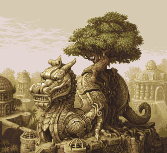
dragon_rider.png


Look at the image, zoom in on it if your screen is too high res. It uses a palette of just 15 colors.
 
This pixel art (linked from the article) is just so perfect:

dragon_rider.png


Look at the image, zoom in on it if your screen is too high res. It uses a palette of just 15 colors.
 I'd like to link to this one: http://www.effectgames.com/demos/canvascycle/

its truely amazing and it's not an animated GIF it's pallette cycling... the examples are stunning.
 
Yupp, there is amazing pixel art out there, sadly often just mock-ups from non existing games that could be great 2D games if really done. :) I know this pallette cycling page, really impressive, especialy with that limited palettes.
I did some pixel-art stley stuff by myself just to learn more about. It's indeed not easy to make pixels look good. And ontop, there is alot of tricks needed like the correct palettes, colors, "composing" etc. And I had to fake alot with no "real" pixel art to be honest due lack of talent. ^^"

However, it's fun and very interesting to dive through all the great 2D Pixel games from the past. I personaly like the Sonic Series on the MegaDrive (only 64 colours) or Metal Slug on the NeoGeo, that's art! Impressive what can be done with a limited color palette, like the 64 of the Mega Drive. The Mega Turrican Game from Factor 5 shows what's possible here. (SNES Version looked even better but no wonder with 256 colours).

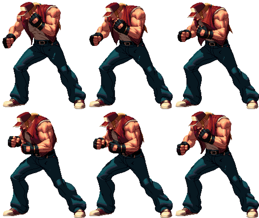
And yes, I also find this KoF 2D Sprite from the article amazing, this is ture skill:

terry-2x.0.gif


Last edited by a moderator:
Bosbeetle:
I'd like to link to this one: http://www.effectgames.com/demos/canvascycle/

its truely amazing and it's not an animated GIF it's pallette cycling... the examples are stunning.
wow! I liked the snow fall. And the dithering to get multiple ripples. The seaspray is surreal...

tip: press the "show options" to see the pallete grid changing.
 
Last edited by a moderator:
Aforementioned examples are almost as good as my new avatar :p

Seriously, that's some amazing skill right there. The video linked in the article is pretty rad, too.
 
The OP's article reports that different devices stretch (okay) and blur (more worrying) his pixel art. That's another thing to worry about when it comes to the Pyra's LCD, although perhaps it's more likely that the blurring is a side effect of the scaling, how it's been configured in the phone's GPU, rather than anything intrinsic in the LCD.

Pixel art's a bit of a weird one. There's definitely some kind of kitch nostaligia going on for it at the moment, but I can't quite pin down when people started deliberately using less colours and a lower than native resolution. I think the first game I played that deliberately did that was VVVVVV, but I saw that as a way to achieve quick restarts and good performance on lower end hardware (although the Pandora can't quite do it justice), rather than a strictly aesthetic choice.
 
Just use 1:1 pixelmapping and you wont have said problem.

Edit: I like how the Marshall-amps say "Hatsk"  which translates to Hatefull
 
Last edited by a moderator:
Back
Top