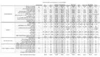
Comparison matrix for keyboard layout proposals


Grench

Forum Addict!
Joined
Oct 3, 2008
Messages
6,629
I'd really like ED's opinion first about what the layouts MUST have and what they MUST NOT have. There's little point in voting about doomed layouts. We could try to extract features from the current proposals and make a poll about them with "must have" "may have" "must not have" scale. These features should contain all the essential design choices (for example in mine that would be full button compatibility with US International keyboard and a mostly unmapped modifier for custom stuff) in all of the layouts, and most of the secondary ones. If we could get community and developer opinion on those we could prune or modify layouts that will never be viable.

Much as we would like to believe, ED is not omniscient.  He won't know what the layouts MUST have any more than the rest of us did prior to doing the hard work of researching and learning what works and what does not.


What the keyboard 'must have' is different from what it 'should have'.  Example:  Letters of the English alphabet.


The items that it 'should have' wind up being user opinion dependent and in direct conflict with each other.  Examples of 'should have':

  • DosBox/QEMU compatibility
  • English letter keys on top layer (unFn A-Z)
  • Numbers on top layer (unFn 1-0)
  • Symbols on top layer (UnFn `-=[]\;',./)
  • AltGr compatibility (REAL AltGr as in right-Alt)
  • P+3 and L+2
  • Modifier controls (Shift, Fn, Alt, Ctrl) on the keyboard to match the controls on the shoulder buttons
  • Only 3 symbols per key
  • "Uncluttered"
  • International friendly
The 'should have' list cannot all happen.  It is simply not possible to do an 'all of the above'.  Some do more items on the list than others, but each item on the list is not prioritized the same by different people.


If the WERE all equally weighted, this layout's 'score':  http://www.keyboard-layout-editor.com/#/layouts/5396ee5f893d78a100dcce1859febcd0


+1 DosBox/QEMU compatibility


+1 English letter keys on top layer (unFn A-Z)


-1 Numbers on top layer (unFn 1-0)


+1 Symbols on top layer (UnFn `-=[]\;',./)


+1 AltGr compatibility (REAL AltGr as in right-Alt)


+0 P+3 and L+2 (They are present as the surfaced symbol keys, but they aren't in the right place)


+1 Modifier controls (Shift, Fn, Alt, Ctrl) on the keyboard to match the controls on the shoulder buttons


+1 Only 3 symbols per key


+1 "Uncluttered"


+1 International friendly


Score: +8 -1 = 7.


This one was a _wb_ modification & cleanup of one of my layouts:  http://www.keyboard-layout-editor.com/#/layouts/3cc8046592f2ce4e6d11ab695b7a1035


+1 DosBox/QEMU compatibility


+1 English letter keys on top layer (unFn A-Z)


+1 Numbers on top layer (unFn 1-0)


-1 Symbols on top layer (UnFn `-=[]\;',./)


+1 AltGr compatibility (REAL AltGr as in right-Alt)


-1 P+3 and L+2


+1 Modifier controls (Shift, Fn, Alt, Ctrl) on the keyboard to match the controls on the shoulder buttons


-1 Only 3 symbols per key


+1 "Uncluttered"


+1 International friendly


Score: +7 -3 = 4.


Another one of mine (my primary one) with the 'kitchen sink' approach:  

http://www.keyboard-layout-editor.com/#/layouts/fcd69e93d9f1fdd811c8d13cc212f3a6


+1 DosBox/QEMU compatibility


+1 English letter keys on top layer (unFn A-Z)


+1 Numbers on top layer (unFn 1-0)


-1 Symbols on top layer (UnFn `-=[]\;',./)


+1 AltGr compatibility (REAL AltGr as in right-Alt)


-1 P+3 and L+2


+1 Modifier controls (Shift, Fn, Alt, Ctrl) on the keyboard to match the controls on the shoulder buttons


-1 Only 3 symbols per key


-1 "Uncluttered"


+1 International friendly


Score: +6 -4 = 2.


Does this seem like a fair way to grade layouts?  Are there other factors that should be added into the 'Should Have' list?

Should we 'grade' more layouts?
 
Last edited by a moderator:
I'm not ascribing omniscience on anyone. The fact is as far as I'm aware he's still the ultimate authority on what goes in the pyra and what does not. That gives him at least dictation on definite musts and must nots, even if the exact layout would be decided by a vote.

Your scoring system seems interesting, but it also seems quite prone to miscalibration and/or misrepresentation because people will have wildly differing opinions about the weighting. I think sharp must/must not would give better information for people making layouts about the support for some of the features their layouts may hinge on, resulting in more viable layouts. Scoring leads to optimizing for whatever weighting is selected, which may not actually reflect all the concerns involved, or weight them weirdly. As is said about many (for example corporate) bonus systems, "you get what you measure", meaning the metric used to gauge success in a complex area will only result in optimizing the result for the metric, which typically does not lead to desired result. This is because the metric is almost always flawed.
 
I think sharp must/must not would give better information for people making layouts about the support for some of the features their layouts may hinge on, resulting in more viable layouts. 
Which assumes that the person declaring the must/must not list already knows the final answer, making the whole exercise moot.

I think that the current process we're doing, regardless of how long-winded and unstructured it is, is getting VERY viable solutions and spotting/refining errors that would never have been dreamed up, spotted or fixed by a single individual.

What you're seeing is the collaborative process at it's best and worst.
 
@Grench: I think 'grading' layouts is a useful exercise, although I wouldn't use it as a direct mechanism to choose a layout (because like you say, everyone has different priorities). We could make a big matrix with such properties in the rows and proposals in the columns, and that would certainly help people to pick their favorite proposals. Perhaps we even find out that some proposals are strictly better than others (because they score better on each single property), which means that either we can ignore those proposals, or we forgot about some property.

Some of those properties you describe are not really clear-cut though, and rather a matter of opinion or degree. "Uncluttered" is one of those: I would say that comradekingu's is the least 'cluttered', and one of your proposals is probably the most 'cluttered', with the others in between, but it's a bit of a matter of taste too. "International friendly" is also a bit subjective: some people like comradekingu will insist that P+1 L+2 (or was it P+2 L+1) are absolutely essential to be international friendly, while others will say that sufficiently free Meta keys are enough, and yet others will insist on dead diacritic keys.

Anyway, yes, I think a matrix of properties × proposals seems like a good idea.

DosBox/QEMU compatibility  --> I think it's a bit misleading to call it like that: compatibility is a software issue. You mean Shift+,./;'[]\-=` gives <>?:"{}|_+~, right?


English letter keys on top layer (unFn A-Z)  --> this is rather obvious, all sane proposals have this


Numbers on top layer (unFn 1-0)


Symbols on top layer (UnFn `-=[]\;',./)  --> very few proposals will have all of those on the top layer,  but some have more than others, so perhaps the matrix should show which ones are on the top layer


AltGr compatibility (REAL AltGr as in right-Alt)  --> does this simply mean not calling the extra modifier 'AltGr' ? In that case, it's not very useful because it's trivial to rename things in any proposal, so this is a rather orthogonal issue (just like the labels for the ABXY action buttons)


P+3 and L+2 --> you mean P+2, right?


Modifier controls (Shift, Fn, Alt, Ctrl) on the keyboard to match the controls on the shoulder buttons --> what do you mean with "to match"? that they're on the same or on the opposite side? or just that the modifiers are available both as a shoulder button and on the keyboard? if the latter, I would also distinguish between the bottom (main) part of the keyboard, and the top / between the nubs part.


Only 3 symbols per key --> number of labels per key could matter (what can physically be printed legibly?), whether or not you need Fn+Shift for symbols like :"{} is another thing, better to split this up (of course you'll always need Fn+Shift, for things like Shift+F1 or capital Ä, but those are arguably less frequently needed than punctuation symbols)


"Uncluttered" --> probably too subjective to include, but as a more objective metric, we could count the average number of labeled symbols per key


International friendly --> too vague, I would split this in three more objective properties: P+2 L+2 (which is already somewhere else), number of free Fn/Meta keys and their position (on vowels or not), number of (labeled) dead diacritic keys.

Some additional properties:

  • For keys/symbols that are not available in all layouts, a simple list of which extra keys are included (e.g. Super, PrintScreen, USB/BT/Wifi toggles, etc)
  • Location and number of shift keys (left or right or both, 2 or 3)
  • Dedicated Esc? Dedicated Tab? Dedicated Ins/Del?
  • Can keyboard Shift and Fn/Meta be mashed together?
 
@Grench: I think 'grading' layouts is a useful exercise, although I wouldn't use it as a direct mechanism to choose a layout (because like you say, everyone has different priorities). We could make a big matrix with such properties in the rows and proposals in the columns, and that would certainly help people to pick their favorite proposals. Perhaps we even find out that some proposals are strictly better than others (because they score better on each single property), which means that either we can ignore those proposals, or we forgot about some property.
It sounds like you have a good plan formulating.

Some of those properties you describe are not really clear-cut though, and rather a matter of opinion or degree. "Uncluttered" is one of those: I would say that comradekingu's is the least 'cluttered', and one of your proposals is probably the most 'cluttered', with the others in between, but it's a bit of a matter of taste too. "International friendly" is also a bit subjective: some people like comradekingu will insist that P+1 L+2 (or was it P+2 L+1) are absolutely essential to be international friendly, while others will say that sufficiently free Meta keys are enough, and yet others will insist on dead diacritic keys.
Yes, there should probably be more flexibility in the scale than the -1, 0, +1 example I gave above. My fear is that if there is too much flexibility in the scale, then people will rate TOO differential in method. I.e. if given a 1-5 scale one user would rate 'normal' a 3 and another a 5. Depending on how it is tallied, the person ranking the layout with a 3 would simply be overpowered by someone scoring it with a 1 or 5. By keeping the scale '3 steps' it contains the score set better. There are logical arguments to be made on whether I scored the above sets properly or if I even had the right questions and if many should be added - that wasn't the point. The point was to try to figure out a method of scoring.

Anyway, yes, I think a matrix of properties × proposals seems like a good idea.
Cool. Do you have time to set it up?

DosBox/QEMU compatibility  --> I think it's a bit misleading to call it like that: compatibility is a software issue. You mean Shift+,./;'[]\-=` gives <>?:"{}|_+~, right?
Correct. Maybe DosBox Compliance? The idea is that every unshifted key on a US standard layout is paired with it's shifted version. To me, this is a binary result. It either is 100% compliant or it fails.

English letter keys on top layer (unFn A-Z)  --> this is rather obvious, all sane proposals have this
Yes, and every keyboard would get a +1 for it. Helps avoid negative scores and hurt feelings?

Numbers on top layer (unFn 1-0)
Yes - this actually impacts my recent proposal more than anyone else's.

Symbols on top layer (UnFn `-=[]\;',./)  --> very few proposals will have all of those on the top layer,  but some have more than others, so perhaps the matrix should show which ones are on the top layer
My suggestion on my 3 point scale is that All on top layer is +1, >50% on top layer is 0, <50% on top layer is -1.

AltGr compatibility (REAL AltGr as in right-Alt)  --> does this simply mean not calling the extra modifier 'AltGr' ? In that case, it's not very useful because it's trivial to rename things in any proposal, so this is a rather orthogonal issue (just like the labels for the ABXY action buttons)
No. It means having a keyboard where the right Alt key can be assigned via an international layout to act as a REAL AltGr and surface the AltGr symbols accordingly. My recent 'numbers behind Fn' keyboard meets this criteria.

P+3 and L+2 --> you mean P+2, right?
Sure. Norwegian keyboard with AltGr activated would be P+3 and L+2. We don't have enough keys for P+3. The idea here was to allow an entry for CK's keyboard's primary feature.

Modifier controls (Shift, Fn, Alt, Ctrl) on the keyboard to match the controls on the shoulder buttons --> what do you mean with "to match"? that they're on the same or on the opposite side? or just that the modifiers are available both as a shoulder button and on the keyboard? if the latter, I would also distinguish between the bottom (main) part of the keyboard, and the top / between the nubs part.
How about do it on a sliding scale then?


Keys on shoulders not present on the keyboard -1


Keys present on both, but keyboard keys between the nubs 0


Keys present on both, keyboard keys in the corners on opposing sides to the shoulders +1

Only 3 symbols per key --> number of labels per key could matter (what can physically be printed legibly?), whether or not you need Fn+Shift for symbols like :"{} is another thing, better to split this up (of course you'll always need Fn+Shift, for things like Shift+F1 or capital Ä, but those are arguably less frequently needed than punctuation symbols)
This keeps being brought up as a reason why we shouldn't put symbols on Fn+Shift. Several of the layouts claim this as a feature - and break up the US keyboard symbol pairs to do it.

"Uncluttered" --> probably too subjective to include, but as a more objective metric, we could count the average number of labeled symbols per key
Sounds fair. Maybe score them all and figure out how many symbols per key the lowest 25% of the layouts are are and give them a +1. Give the highest 25% a -1 and the rest 0?

International friendly --> too vague, I would split this in three more objective properties: P+2 L+2 (which is already somewhere else), number of free Fn/Meta keys and their position (on vowels or not), number of (labeled) dead diacritic keys.
OK - sounds fair.

Some additional properties:

  • For keys/symbols that are not available in all layouts, a simple list of which extra keys are included (e.g. Super, PrintScreen, USB/BT/Wifi toggles, etc)
  • Location and number of shift keys (left or right or both, 2 or 3)
  • Dedicated Esc? Dedicated Tab? Dedicated Ins/Del?
  • Can keyboard Shift and Fn/Meta be mashed together?
Those are good criteria for a features list, but would need to be re-worked into a scoring system. How would you score Dedicated Esc, Tab, Ins/Del so that it doesn't swamp the scale? Give presence/absence of each 0.5 points?


Extra keys(Super, PrintScreen, USB/BT/Wifi toggles, etc) included is an interesting one. There are a few people who have stated that they're just 'clutter'. I think they're valuable and try to squeeze as much out of each one of those buttons as possible. How to rate it though? I've seen comments where people argue against having a USB toggle because it might not save any power.  I'd want to have it anyway so that I can force-disconnect the port if I want to without unplugging.  Useful with wireless and LAN adapters.


How about:  1 shift key is -1. 2 shift keys is +1. 3 shift keys is 0?  Sorry if I'm showing bias, but 3 shift keys is asinine.


IMHO mashable Fn+Shift should be on the list twice - once for the main keyboard and once for the shoulders. +1 for each instance where it is present and -1 for each where it is absent. But I'm biased on that too.

We could add shift and Fn lockable as a category or two...  It's easy to start stacking the deck, but where do we cut off the 'feature list' to be used in the 'Should Have' matrix?
 
OK, here is my attempt.

This took quite a lot of time, I'm quite tired of this now :)

Here's a PNG file (the board only lets me upload a limited number of file extensions)

keyboardlayouts_matrix.png

Here's a ZIP file with a spreadsheet in it that you can edit, so you can input your own priorities, or add other proposals:

keyboardlayouts_matrix.zip

I just filled in some example priorities/weights to give you an idea, it's not even really my own set of priorities, that is, I didn't give it much thought, it's just to illustrate. E.g. I gave a weight of 10 to things that are probably hard constraints (like the double-width space bar), a weight of 1 to boolean things, and a weight of less than 1 for non-boolean things. I gave a negative weight to "number of shift modifiers" because I think 3 shift keys are actually worse than 2 (of course, if you disagree with that, your priority should be 0 or positive for that one). I also gave a negative weight to penalize keys with 4 labels and to give an advantage to layouts with less labels per keys on average.

Have fun with this!
 

Attachments

  • keyboardlayouts_matrix.zip
    91.7 KB · Views: 333
And before anyone asks: yes, I feel a little bit crazy now. But in a good way!

It's quite insane how much time and effort this community is spending on just the keyboard layout. It shows how much we care about that keyboard. We as a community are very lucky to have a device manufacturer (ED and team) who actually listens to community input, and they are very lucky to have a community which is that dedicated.
 
Haha!  This is the finality of all keyboard thread finally I hope! _wb_'s designs get the highest scores ;)
 
Last edited by a moderator:
edit2: A lot of the things in the this thread hurts my head.

Edit: It took the ergodox team 6 months+ to make their functional layout/setup, and they are 13 or so people.

WB: Is this the new public management way of design?

How about a simple flowchart

  • Users know how to use it already
  • Users can type on it
  • Typing is efficient
  • Typing adheres to keyboard standards
  • It looks good
  • It can easily be changed or replaced
  • It is modifiable
  • It extends capability

If you design without users in mind, then thats bad news for users.

Right off the bat here a lot of concepts fail. "Shift+something thats semi-related to AltGr" is one of those things. Boil it down to regular AltGr, and it _still_ fails. Thats the level of difficulty we should target. Why? Because thats a "will not buy" on what is otherwise a home-run device. Do the research. No regular user ever looked at a keyboard and said "i cant work this out, ill buy it"

Cutting off keys needed is like taking away keys on english layout. There is no smart way to get around it. The smart move is not do do it. Because again, sales. Absolutely fails. Right there we lost all of scandinavia, germany, etc, and we made it harder for every other person whos sole language isnt english. So we still have advanced english users.

Typing should be laid out with a minimum of excess movement. Some layouts are slaloming lef and right more than once every sentence.

That ruins everyones day. We should target the concept that at any given time is the most efficient. Measured in distance traveled in typing time.

Keyboard standards are good, inventing new ones fail by default, and never work in the wild. We should keep it basic.

Looks are good, and if they are good enough, people will buy it on aestetics alone. That may be esoteric, but its real. Being sleek is a target that wins over customers, and doesnt scare people away.

Changing parts or the whole layout without having to remap left and right recursivly is good. Meet more needs, not less.

Same goes for making adjustments. Or safeguarding against not putting all eggs in the same basket. This is important and its a potential for fail.

It took the ergodox team 6+ months to design a keyboard, and they are 13 people.

Comments:

Its not equally good to have to type AltGr+ extra foreign clutter on the keyboard as it is to have dedicated buttons.

You havent considered ways to input symbols. More standard opportunity and special opportunity is better.

You havent considered how many keys are wasted on duplicated modifiers for no good reason. There is a lot of that

Its not equally good to have more dead-key diactrics on the same keys, because then you have to shift+altGr+ etc

There are no overall metrics. There is no particular reason not to sin against one concept and stick with the other. There is no reason to balance anything.

The only feature on my keyboard that sets it apart is efficient typing, and i dont mean _not_ failing, i mean trying to be as efficient as possible for as many people as possible.

The list goes on and on. Check out how things fare in this all-encompassing comparison: http://boards.openpandora.org/topic/16872-and-now-for-something-completely-different-keyboard-option/page-11#entry381299

To be able to load dosbox without a keyconfig is about as far down my list as you can get.

Edit 3:


Symbols on top layer: 5 [ ] < , .   and 4 shift+ combos { } > :


Space does space only?

That would look nice, and be consistent with non-hacky keyboards. But the space on the pandora, and the pyra since it doesnt have stabelizers, is in nature a key that can be hit on either side, not the middle. Since there is no reason to hit space anywhere but key 10 on bottom row (that being more efficient) there is no reason to make it a longer key.

Unless you want it to be recongnizable. Which is a question of how much was spent on case-molds, and how non-symmetric you want it.


Tab does tab only? etc


Deducted points both for having AltGr and meta _and_ for using meta for less things, whhhhaaaat?


If you are giving points for having F-keys visible, and being able to shoulderpress them. Ok, that sounds like an advanced user right there. Because we _completely_ ruin any novice users chance at using this.


Isnt it then a little bit important for that same advanced user that it is possible to press shift+Fkeys?


Full ISO keyboard thanks to hardware Fn?  Could you explain this? Fn has _nothing_ to do with ISO keyboards, it doesnt belong there. It is a hack.


What do you need super for? The question im asking is why use a button on something that isnt used for a single thing in xfce? Is that good design?


So you deduct points for non-standard numberrow. Ok.

Did you consider AltGr fails?

Why would i do it if it wasnt a reason behind it?


My layout has all the dead-key diactrics, 10 on number row, the rest on each side of space.

By virtue of having L+2 and P+2, you also get some really strange extra ones, like hawaiian Okina  Read about it here

Room for improvement is to make it one-per key with the ones adjacent to space too. Of those only the ä-mod is used, and you can get to that at ctrl+alt+swipe-shift anyhow.

It has accent aigu circumflex and grave as swipe-combo. Those are the 3 most used ones. And integral for french, which has them number-row.

Ctrl+Alt is a standard way to input dead-keys. One that can be used from shoulders across.


Why do you need shift+AltGr hold-combos? More specifically, why do you need them so much you take away a central key to be able to do it less efficiently than with shoulders?

At the loss of real shift+ swipe combos...


ONE point for having p+2 and l+2 available as tradable, non-filled keys... ONE.


If thats the single point i made, then it was all worth it. That is the single point that makes it usable. Anything else is a toy to half the community.
 
Last edited by a moderator:
I think sharp must/must not would give better information for people making layouts about the support for some of the features their layouts may hinge on, resulting in more viable layouts.
 
Which assumes that the person declaring the must/must not list already knows the final answer, making the whole exercise moot.


I think that the current process we're doing, regardless of how long-winded and unstructured it is, is getting VERY viable solutions and spotting/refining errors that would never have been dreamed up, spotted or fixed by a single individual.


What you're seeing is the collaborative process at it's best and worst.
Well, no. Same as people making layouts people not making layouts may have some priority features. Consider the "must" answers like "if I made a layout, it would have these". The "must nots" should be quite rare answers, but some may have strong feelings toward, for example, driver-level modifiers or putting numbers behind a modifier. The expected answer to such a poll would be some "must" answers, none to few "must not" answers and many "may" answers. It only helps frame the discussion.

And before anyone asks: yes, I feel a little bit crazy now. But in a good way!


It's quite insane how much time and effort this community is spending on just the keyboard layout. It shows how much we care about that keyboard. We as a community are very lucky to have a device manufacturer (ED and team) who actually listens to community input, and they are very lucky to have a community which is that dedicated.
That's actually quite impressive. The weights are of course a matter of discussion (getting -10 for having one too many modifiers when the scores are ~20-~30 is QUITE harsh), but I like that you put in the effort for mapping all the keyboards. I still think, as I replied Grench, that if we fix the weights it may result in optimizing for the wrong thing (which is what I think comradekingu meant with his post as well). However, that chart could be made into a tool for people to compare the layouts with. If the weights could be set by the user (as those weights are probably subjective) or somehow averaged over the community opinion, it could provide useful information.
 
Last edited by a moderator:
The point of my exercise was indeed to give people an evaluation tool. In the .ods spreadsheet (it's in a .zip file for silly board reasons, if you unzip it you get a .pdf and a .ods) you can change the priorities and the scores will automatically get re-calculated. That's what spreadsheets are good at :)

The priorities I set originally are just an example, I'll try to come up with a set of weights that correspond to my priorities (and encourage everyone else to do the same thing), and we could try to come up with a set of weights that are representative for the average opinion of the (vocal part of the) community.
 
But then your layout is the benchmark. Right now my layout is just very bad at being your layout. It doesnt have a holistic approach.

Pleasing the most users and excluding as few as possible should be the goal. Within reason you can chalk out what the use-cases are and look at ability and ease of typing between the layouts too.

Looking at the final layouts, aka the ones that could be balanced, it boils down to a list of "do i want these drawbacks" or "do i want these drawbacks"

I am happy to compile a list for each layout once it stops changing for some time.
 
I still haven't read everything yet.

If the weights could be set by the user (as those weights are probably subjective) or somehow averaged over the community opinion, it could provide useful information.
This is probably the way to go.  The problem with weights according to users is that it would require a lot more work.  A much more detailed poll than what can be made here, that automatically calculates the total value per layout might work.  

To save on all that I see 2 options which both might not work so well.  ED can designate the weight, however his concerns may not reflect what is important to users, and some people may come up with useless layouts that score higher, but follow no standards (by this I mean typical layout and function) and are not made with real use in mind.  The other is we can try to get everyone here to come to a consensus.  That is probably impossible.

Something I think needs to be heavily weighted is that it matches a typical layout.  I think US QWERTY is what most are going for, but if more people prefer UK that can have more weight.  I think that ease of use without shoulder buttons for non-game use should be considered.  This can include use on a desk, or not.  I understand both of those are probably not important to most people, but it should matter a little, especially considering that we may get a dock.  

Some things don't need to be considered beyond "if yes it gets calculated, if no it is unacceptable and will not be considered".  The main one I am looking at is double wide space bar.  Sorry...  I feel ED has made it clear that we will be getting that, and it will be in the lower right of the keyboard.  Layouts that do not conform to this are extremely unlikely to be given serious consideration by ED.

I have a lot more to say, but not now.  Maybe I will get back to it some day.

_wb_, I also talked to a few non-Pandora/Pyra people regarding their feelings and advice about keyboards.  Although I never shared the horrible layouts I made, I care enough about the keyboard to intentionally reached out beyond the target audience to figure out what matters.  The problem should be obvious; most people don't really think about a keyboard unless there are differences or problems with the one they are using, so they don't know or care what is best.  I am guessing at least a few of us here thought about keyboards before these discussions started.  I have personally looked into a variety of keyboards over the years, including chorded keyboards and Dvorak (I don't want to just change it in software and move my keys).  When I decided to buy a decent one I stuck with something that is mostly like what is found in my part of the world to avoid needing to relearn qwerty when not using mine, which can be a serious and expensive problem in some situations.  QWERTY won only because I must remain proficient with it.  So bad.
 
That is not the way to go, its design by community. We will invariably end up with a lot of not-in-connection errors. If the layout was generated on the fly maybe.

In reality its a big flowcharts with caveats for each possible choice.

The two major directions to go is

Reduced layout: Less familiarity for english users  No funky diactrics. More space to implement duplicated keys. Then i could link to the research on all those variations. Comparativly less ways to type language. AltGr combos and Shift+AltGr combos. You exclude half the community by calling them "international users" and you have to employ non-standard ways to hack them back in, on a per-language basis. You do worse with everyone who isnt thrilled about seeing german characters on their device.

You can have ctrl and alt in the regular places, but those places arent as good, because its a two-thumb keyboard. Not a whole lot better than column-row. And efficiency is still with shoulders anyhow.

Fuller layout: Tab is in a worse spot.

One opinion brought up against it claimed it was less balanced, yet that is only regarding "reduced layout as a goal", with the inherrent exclusion therein in mind, i think that only can at most hold true for half the audience, with less than that actually thinking so. Then you subtract those who know more than only english. 

Fuller layout is more similar to the balance on a real keyboard, which is a fairer metric. With weight-balance being shifted left before, this solves that issue. (Since modifiers go on the right). Modifiers are now more effective, so more birds with the same stone.

 You still have the "international users" do you want to prioritize their way of p+2 l+2, or do you want more efficiency by going to shift easier.

→ If your design-goal is efficiency over international users, then ok, thats the choice you made.

The reason I did it is also because international users didnt get anything before, comparativly, so its a bonus with respect to the others. Both english and international users should get something extra without losing anything. And if push comes to shove, you have to decide between them.

To me slalom-typing isnt a option, because there arent any good arguments to support it. And its not needed, aka we can do without.

I dont see how its different from the voting in "explaining keyboard layouts", because i tried to ask the questions that needed to be asked, rather than a lot of feel our way to something-design.

I dont know what topics havent been discussed. Its fair to assume not everyone has read all the keyboard threads, but it looks like more progress is made now. Really like the holistic design-metrics brought into play.

AltGr vs AltGr and meta vs Meta only  vs  Meta only and additional AltGr.

AltGr

Everything works, There are no Fkeys.

AltGr+meta

Comparivily more possibilities. Everything works except typing F-keys from shoulders.

Meta only: Hack, benefit of 2per key at the cost of familiarity. Uses one less key for modifier.

Meta only+Additional AltGr: Hack+confusing, right way to do something terribly wrong. Uses the amount of keys on modifiers to get it right, but is still wrong.

A thing to consider with all options is print placement on the key and possible colour-combinations.  Options being

1 2 3    Regular    Shift+   AltGr+                        either dont have F-keys, or dont print them. (sub-option to include instructions in conkyconfig)

1 2 3    Regular   Shift+   AltGr+ and Fkeys,      where Fkeys are coloured with the 3


1 2 34    Regular   Shift+   AltGr+ and Fkeys,     where Fkeys are coloured alongside the 3


1 2 3   Regular  shift+      meta+                          where Fkeys and AltGr symbols are treated as the same both in terms of colour and position.

1 2 3 4  Regular Shift+   meta+   Shift+meta+  Less visibility, less standard, i dont even.    
 
Last edited by a moderator:
I uploaded the spreadsheet to Google Docs and entered my personal opinion by means of weights:

https://docs.google.com/spreadsheets/d/1DE81karFHeHN-_DIyBmi2aHyuLBYegwc5ZNrFCBl5_Y/edit?usp=sharing

Please feel free to make a copy, enter your own priorities, and report back!

Here is a link to a "Community document" that anyone can edit:

https://docs.google.com/spreadsheets/d/14mVNNzLhmhyA4sCIAPSoDv404xtctfLSiEMTtTlEzfw/edit?usp=sharing

On the right hand side you can add a column with your own weights, and the overall weights that are used are the average of all those columns on the right. Since the weights themselves are not normalized, this is not really a fair mechanism, but it's a start. I entered my own weights and also a column called "ED?" which attempts to indicate what I think are ED's priorities, e.g. having a double-width space and only one extra modifier are almost hard requirements, labeled German letters are good (not for me but for ED and his German customers), and having a third shift is a nice extra.

Feel free to add your own weights to that document.
 
Labeled chorded german letters are not better than having keys there to blindly press after changing the layout. Thats how typing works, and thats the reason its so disasterous when its taken away.
 
Last edited by a moderator:
Labeled german letters are not better than having keys there to blindly press after changing the layout. Thats how typing works, and thats the reason its so disasterous when its taken away.
I mostly agree, which is why I gave a big positive weight of 8 to "P+2, L+2 available for remapping" and even a slightly negative weight of -1 to "German letters labeled".

You probably think this is even more important than that, so if you set your priorities, you should give it an even bigger weight, and surely your own proposal will come out as the best one.

I don't believe in actual blind typing without re-learning though: muscle memory from finger typing just doesn't directly translate to thumb typing. It helps to have keys close to where you expect them, but new muscle memory will have to be trained anyway.
 
Yet another variant of my proposal: https://docs.google.com/spreadsheets/d/1DE81karFHeHN-_DIyBmi2aHyuLBYegwc5ZNrFCBl5_Y/edit?usp=sharing

It's a somewhat simplified and German-centric variant: I removed the labels indicating dead diacritics (though they could still work like in the other proposals, just not labeled; for dead acute, umlaut and grave it's still easy to remember where they are, for circumflex and caron not so much), the label for Compose, and the spelled-out "Meta" (so now it's just the symbol ◆). I added labels for German letters and Euro sign, but not in bold like all the other labels, and in a darker shade of the auxiliary color. That's a kind of compromise between not labeling them and labeling them.

I added it to the comparison spreadsheet:

https://docs.google.com/spreadsheets/d/14mVNNzLhmhyA4sCIAPSoDv404xtctfLSiEMTtTlEzfw/edit?usp=sharing
 
A suggestion for your spreadsheet, _wb_.  Would having keyboard-based modifiers be a worthy benefit for those typing on a desk?  Is it worth having a scorable TRUE/FALSE row for that, or perhaps all designs implement those keys - I've not checked?

Really cool spreadsheet though.  I've had a playabout with the weightings and got it coming out with some quite different gradings.  I'd suggest getting rid of the backgrounds of the top scorers unless you can automate it though, since even small changes to the weightings can affect which layouts come top.

Also, are you still maintaining the ods file? I can't read google docs without a bit of faff, so the ods file is easiest for me.
 
Last edited by a moderator:
Back
Top