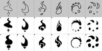
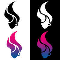
Logos from Erico


erico

Advanced Member
Joined
Oct 25, 2011
Messages
1,778
Age
48
Location
Brasil
Website
sites.google.com
Hello there, here goes my attempt.

Some prior thoughts:

. Pyra is a girl, so the logo should be of a round type

. Girl´s hair and fire element should be considered

. Pyra and Deucalion were the only survivors from some great deluge, therefore water element should be considered

. Logo must fit a square/perfect circle frame, will try avoiding horizontal/vertical frame for production´s sake.

Starting with its shape, here is a black and white study/sketch.

I marked the ones I kind of prefer in red.

The plan is to investigate and final art a few of them.

Let me know if there are any others in the picture you think are worth looking into, or if some of my picks are not worth the ink it uses.
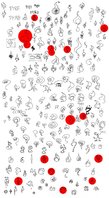
LOGO RAW_02.jpg
 
Something bold, 3d element, works in different ways. Those are things ive found people like.

Outline logos are on the way out, solid colour logos are the current thing. If only black and white you could do gradients, or if thats not allowed, do pixel cutouts to get the same effect only in low-fi.

I liked the two bottom middle red ones best since they have a unity to them.
 
Last edited by a moderator:
Thanks for the feedback.

Something bold, 3d element, works in different ways. Those are things ive found people like.

Outline logos are on the way out, solid colour logos are the current thing. If only black and white you could do gradients, or if thats not allowed, do pixel cutouts to get the same effect only in low-fi.

...
I agree with you, this will get there.

That was early stages of a creative process, just prime sketches I felt I should share to get some feedback.

Out of a first selection, I have fine tuned a bit and made variations of them (1-12).

I´m now thinking to move from an ´element´ logo to a ´human´ one while still preserving the girl+fire+water prime idea.

So I think it should be a girl´s head, fire hair and water face.

Logos 3,8,9 and 10 depict that and I enjoy them the most so far.

Logos 1,2,4 and 7 are a kind of mixed element/human design.

The rest is purely element while remaining female for its round forms.

The shapes still need a lot of work and balance, eyes could be included and so on, etc,etc.

But I would like to take only 3 designs forward to next stage at most.

What do you guys think about it? 

LOGO OUT_01.jpg
 
11 is my favourite. Super simple, and follows a pattern. Doesnt get dull.

I cant unsee the hair thing on 5, i see it as a portrait face, and it doesnt work as it is now.

6 and 12 i get a feeling ive seen before. Needs to focus more on how one of them is a dot if its to work.

People are partial to organic desings naturally, and it balances round and pointy very well. Thin is a thing of the times now.

I thought of it as the stain a bottle leaves if its wet underneath, and it still works, so its a good design. Those type of naturally found patterns are very exciting.

Also i see it as a dragon shape, and flame from its mouth.

Try having a white gap where the dots begin, maybe throw them in the opposite order. The rotation is also something that could be explored. Turning the hair logo sort of fixed that, and it seems 11 strikes the balance of what 11 is. Is it intentionally so, or did you draw it like that. Catering to a mostly right handed audience it makes some sense to start it where you would start a letter or a shape. 10.30 1.30 12 6 and 3 o clock are those places for me.

Main problem is it doesnt look distinct from a distance at first glance, it turns into a circle, but once you know the shape beforehand i suppose that would make you go closer to see its true shape.

Introducing an element into the middle would solve that, a box would make it a dragonbox logo,the dragon protecting the box, and sort of a trapezoid into cone as well.
 
Last edited by a moderator:
5 and 10. Not sure why, but they feel like the ones with most personality.

EDIT: also the hair-interpretation of 10 is a plus. Brings it back to the flaming red hair of Pyrrha :)
 
Last edited by a moderator:
I like 10. Maybe tweak it a bit to look even more like face+hair, perhaps with some more face details like eyes. If you can make it reveal something when rotated 180 degrees (e.g. a letter P), you get extra points :)

5 looks like the firefox logo to me.
 
I think that is a reduction ad absurdium argument. I understand the sentient that it would make sense, but in the sense that it would, wouldnt you then do it differently?

The pizza that wants to be a fish dish isnt going to be a good pizza anymore.

If you did flames starting as hair i would do it in some variant that covers half the face and has the hair in a comb pattern. Then do one eye.

Drawing a face isnt a good logo, alluring to one is. Difference being mascot to something emblematic, a reduction of something.

To reduce and yet add detail is what is hard to do.

What if the dots tag inwards? I like 3 dots when there is just an outline, maybe try that with the solids. All solids look better than outline.

If 3+1 dots dont do anything beyond 3 dots then 3 dots is optimal. Also i think logo 5 is the firefox logo.
 
Last edited by a moderator:
9 and 5 are my favourites. I also like one of the variants not in red. It is like a ying yang, but on top is something that makes it look like a Y (would be better as a mix with P).
 
3, 9 and 10... all look like a womans head with fiery hair... 9 with a bit off-key eyes.

I like 5 best though too
 
The cool thing about 5 is that it would be easy to make into a loading Spinner for Pyra applications. ;)

-God Ginrai
 
10 is pointy in  a not good way, and thats much of what is there, so its back to the drawing board unless  a crows foot is what you want to be doing.

Its a good flame, sort of windy, needs focus on that, as the whole is in between working concepts.
 
Last edited by a moderator:
10 is my preferable so far...it sure needs less pointy corners, and water must be there.

Next round of refines will take a little while though.
 
Not sure how many will get the water reference, but if it works in the logo, go for it.

I guess Protogenia is Pandora 3? :lol:
 
Soon to come, sometime this week. Finer details take time to do, and once in a while you have to stay away from it a bit so not to be blinded by results.
 
Ops, there is already a voting, maybe I was too slow  :D

I was going for the crow foot logo and was messing with colors/shape and wanted to add an ear ring for that punk look. Dropped the eye idea as it was too much a beauty parlor sallon logo...

Anyways, here a closer to finished result.

LOG_01.jpg
 
Back
Top