Log's including Pyra that may or may not look like Swastika and the ensuing discussion


Agrajag

Member
Joined
Aug 26, 2012
Messages
33
Location
UK
There's a long history of logos just looking like images and then years later someone going "Oh shit, has THIS been in the logo all this time?"
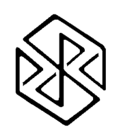
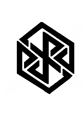
On that note, while I think there's a lot of potential in comradekingu's logo, I really have to agree with T4b: the merged YR in the middle looks worryingly similar to a swastika. I didn't see it myself at first, but my mum just glanced at it on my tablet and pointed it out straight away, and now it is glaringly obvious to me.

Binky's variation with the separated Y R looks much better. If they are going to be merged, they need to be rounded instead of angular.
 
Last edited by a moderator:
Combined with the black/red colour scheme, that swastika resemblance could be a major problem.
 
the merged YR in the middle looks worryingly similar to a swastika.
Ah, yes, the "was that there all along?" is best for good things, like the arrow in the FedEx logo, or the bear in the Toblerone logo, or letters in some of our cases. Swastikas should probably be avoided. Probably.
 
There are reasons the 27 and similar versions works, here is the thin version to better see the middleground to the bold one.

pyraild27d.png

Noone tells you what to see moreso than your own mind.

Please dont take on the ignorance of others, i am sharing my culture, to which nazis were hostile. Inherrently foreign to the sharing of proud rites and tradition.

Read my posts and learn from them, at the very least how to form constructive posts.

Just like my logos arent meant to be viewed on a tablet they arent for the mindset of telling others what to think.

The only reference to modern day germany is bauhaus. That was shut down by the same cultural mindset that discredits me from continuing my thread.
 
Last edited by a moderator:
I think I'm being very constructive by pointing out something that could be disastrous for the project, and it is not my intention to offend or attack you.

My reading and understanding your posts and being sympathetic to your culture is not going to stop other people seeing my Pyra and wondering why it has a logo that looks rather like a swastika.
 
IMHO, the logo has nothing even vaguely resembling a swastika. You need real imagination and predisposition to see crossing angled stuff as swastikas to get one out of that logo. If I'm missing something please post a picture where you've outlined the swastika in the logo so I can see it as well.
 
Lots of symmetrical things look a bit like a swastika if you apply enough imagination. I mean, even something like the Windows logo contains a swastika if you want it to.

I think this logo is fine. Maybe if the tail of the Y and the top part of the R would be more rounded, like |) instead of |>, then it would look even less like a swastika. But it's OK as it is now.
 
Oh dear, when I decided to get more involved in the forum after a long absence, I didn't expect my first conversation to be on a subject like this!

I'm not on a position to edit and upload pictures right now. All I can say is I'm not predisposed to seeing swastikas everywhere but the merged YR in the thick lined versions of the logo just leaps out at me now, and I'm clearly not the only person who sees it.

Actually, the fine lined version in post 164 does look a lot better. I'll just back away slowly now and get on with my day...
 
I can see where Agrajag is coming from, I too saw it from early on versions of this logo, but at the same time I don't think it's that obvious.


I don't think it needs to change as when inspected it clearly doesn't include that symbol, but anything that has 'that line' in, and then another line crossing it is going to cause a second glance to some people I reckon.


'that line' being the one that starts at 12 o'clock, goes to 10 o'clock, to 4 o'clock then to 6 o'clock


But as I say, any shape with crossing and similar lines could potentially look similar. But only at an initial glance
 
I like this one (Bold) but it should have a different cut.
post-2326-0-78254500-1390276933.png
 I still think the vertical cuts that define the leg of the Y and the tip of the Y to be imperative to this logo. I think when you change those to diagonal cuts, like in some of the later iterations that comradekingu did, that it ruins the Y and R. Makes them look less Runic, and more... blocky.

If anything we'd more likely be sued by bluetooth for using part of their logo :p

hero_bluetooth.jpg
Whoa, man... Don't be posting pictures of Swastikas... ;)

-God Ginrai
 
I can see where Agrajag is coming from, I too saw it from early on versions of this logo, but at the same time I don't think it's that obvious.


I don't think it needs to change as when inspected it clearly doesn't include that symbol, but anything that has 'that line' in, and then another line crossing it is going to cause a second glance to some people I reckon.


'that line' being the one that starts at 12 o'clock, goes to 10 o'clock, to 4 o'clock then to 6 o'clock


But as I say, any shape with crossing and similar lines could potentially look similar. But only at an initial glance
But none of those lines are at right angles and the crossing line doesn't have any appendages at all! I now know what part of the logo we are discussing but it's still farther from a swastika than an upper case X in serif font. At least the X has appendages in all ends even though the angles are still as wrong.

To me it sounds like confusing squares with triangles. Both have sharp corners and a different number of lines at different angles :)
 
Yep, not at right angles, which is why I mean it only looks similar at a glance.

That symbol is burnt into our minds at a young age as a bad symbol so lines like this where they cross can look a bit like it I guess
 
Yep, not at right angles, which is why I mean it only looks similar at a glance.

That symbol is burnt into our minds at a young age as a bad symbol so lines like this where they cross can look a bit like it I guess
The swastika has a much longer history of being a symbol for good than it has of being a reviled symbol, thanks to Nazi Germany. That part of history is now thankfully over and people shouldn't be afraid to create imagery that might include unintentional passing resemblances.

http://history1900s.about.com/cs/swastika/a/swastikahistory.htm
 
Note that I didn't write "there is a Hakenkreuz in there" but "I always end up searching for one", which is a difference. There is no exact Hakenkreuz in it. It just reminds of them. comradekingu's reaction (in a pm - not going to quote it in this case) shows that he himself is aware of the connection - it's based on the same thing the Hakenkreuz is based on. That's no Nazi thing, they just stole it from other people. But sadly that doesn't matter - it will now be associated with Nazis forever.

But even apart from all abstract associations it's still bad!

A logo should be instantly recognisable. If there are also hidden messages then that's just a bonus, it can't be the only thing.

Edit:

That part of history is now thankfully over and people shouldn't be afraid to create imagery that might include unintentional passing resemblances.
It's not the Pyra's task to rehabilitate culture overshadowed by Nazis with the risk of being associated with Nazis itself.It's task is to be a free gaming mini netbook.
 
Last edited by a moderator:
How would this logo not be instantly recognizable? I don't know of anything I could confuse this with.

-God Ginrai
 
Back
Top