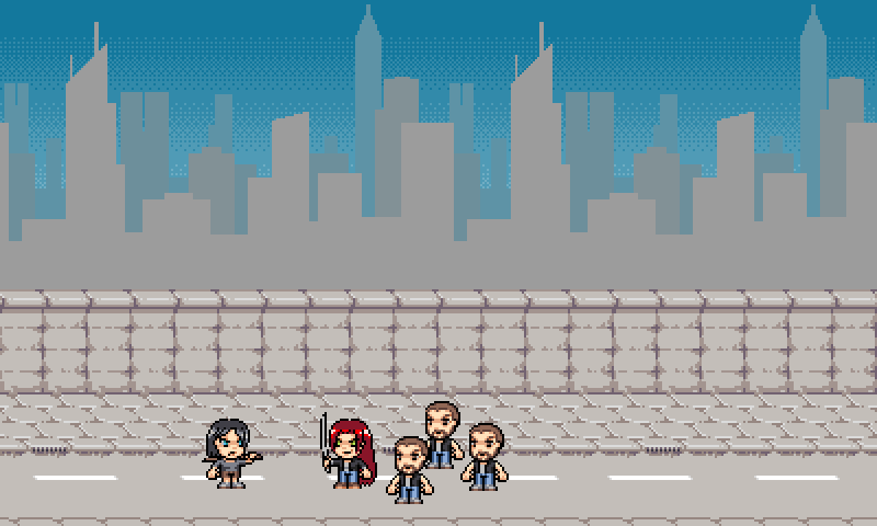
Onee-sama Tasukete!


Oh my god an update!? Starting to work on this again and today I slapped together a walk cycle:

onee-walk.gif


Crits?
 
GizmoTheGreen said:
bigsister save me!
sounds cool! :p

the sprite looks cool, the sword need more gradients though...

If she gave more gradient to the sword, it wouldn't look right. Look at the gradients in the rest of the image. If she gave the sword a gradient, it would have a finer gradient than the rest of the sprite. Then, she would have to edit all of the sprites to give them all a finer gradient.

-God Ginrai
 
Last edited by a moderator:
God Ginrai said:
GizmoTheGreen said:
bigsister save me!
sounds cool! :p

the sprite looks cool, the sword need more gradients though...

If she gave more gradient to the sword, it wouldn't look right. Look at the gradients in the rest of the image. If she gave the sword a gradient, it would have a finer gradient than the rest of the sprite. Then, she would have to edit all of the sprites to give them all a finer gradient.

-God Ginrai

it just looks off...
one brown color and hard black edges
doesnt match rest of the sprite imho
 
Last edited by a moderator:
Just wanted to say that I prefer enemies that are at least slightly challenging. My favourite sidescroller has to be Streets of Rage, just because of how well the enemies (seem to) anticipate and dodge your moves.

Nice art anyway. B)
 
oneesama%20tasukete.gif

Haha does anyone else think the guy looks just like Francis from Left 4 Dead? Haha but anyway love the sprites, they are awesome.
 
SomeGuy99 said:
Just wanted to say that I prefer enemies that are at least slightly challenging. My favourite sidescroller has to be Streets of Rage, just because of how well the enemies (seem to) anticipate and dodge your moves.

Nice art anyway. B)

Indeed, if this played similar Streets of Rage, I would be extremely happy. ^_^

-God Ginrai
 
Last edited by a moderator:
MooseCantTalk said:
Haha does anyone else think the guy looks just like Francis from Left 4 Dead? Haha but anyway love the sprites, they are awesome.
Well I was playing Left 4 Dead a lot when I started working on the sprites and Francis is my favourite character... ;) Maybe that'll be the enemy name. Francis.
 
Last edited by a moderator:
Eniko said:
Moar art? Moar art.

oneemockup.gif


Need to tile up a few buildings and then I think I'm ready to start programming.
+1 for retro-raster sky gradients. Me likes! :) Buildings need more detail and maybe a fit into "rule of 8" but I already see it (parallax)scrolling. :)
 
Last edited by a moderator:
The dudes look like little George Michael's, and the babes look like Melrose Place/Desperate Housewives Ladies ..

EDIT: this means I hope this game will be violent, heh heh .. ;)
 
fusion_power said:
+1 for retro-raster sky gradients. Me likes! :) Buildings need more detail and maybe a fit into "rule of 8" but I already see it (parallax)scrolling. :)

What is it with you and your "rule of eight" fetish, seriously?
Not everything has to be a multiple of 8 in dimensions you know, that does not always look best... (additionally it's not really matter of speed anymore nowadays)

I am not a huge fan of the retro-graphic-style, but this is a very well made one, which even I like ;) The foreground looks pretty detailed (although there probably are only 4 different blocks) and especially nice!
It's a bit too grey-ish now imo, but that probably fits good into your settings (also I suppose not every level looks like that).
Also: Another "Yay" for L4D Francis :D

I certainly hope for some fast action and bloody kills ;) Keep it up!

foxblock out
 
Last edited by a moderator:
foxblock said:
What is it with you and your "rule of eight" fetish, seriously?
Not everything has to be a multiple of 8 in dimensions you know, that does not always look best... (additionally it's not really matter of speed anymore nowadays)

I am not a huge fan of the retro-graphic-style, but this is a very well made one, which even I like ;) The foreground looks pretty detailed (although there probably are only 4 different blocks) and especially nice!
It's a bit too grey-ish now imo, but that probably fits good into your settings (also I suppose not every level looks like that).
Also: Another "Yay" for L4D Francis :D

I certainly hope for some fast action and bloody kills ;) Keep it up!

foxblock out
It is not my rule and I doubt I mentioned this before, so why do you call it Fetish? I can write my opinion here like every other person. I just give some tips to deal more easy with Pixel graphic because from my own experience, you will not end with no-fitting graphics when the tile-size fits into the screen size without compromises. ;)
And you don't even notice, if a graphic fits into the "rule of 8", it is just a invisible grid where some elements fit, mainly during drawings. Do you really SEE, that this foreground here fits (mostly) in the rule of 8? :lol:
 
Last edited by a moderator:
Eniko said:
Right now I'm looking at 20x20 tiles. Since when does power of 2 dimensions apply to software blitting, exactly? Did I miss a memo?
not meaning to argue or anything, but even software blitters care about things like cache-line sizes, and those come in, well, you guessed it..

/more power to 2!
 
Last edited by a moderator:
fusion_power said:
It is not my rule and I doubt I mentioned this before, so why do you call it Fetish? I can write my opinion here like every other person. I just give some tips to deal more easy with Pixel graphic because from my own experience, you will not end with no-fitting graphics when the tile-size fits into the screen size without compromises. ;)
And you don't even notice, if a graphic fits into the "rule of 8", it is just a invisible grid where some elements fit, mainly during drawings. Do you really SEE, that this foreground here fits (mostly) in the rule of 8? :lol:

The word "fetish" might have been a bit strong, I apologize, but I really wanted to know why you think having everything in base-8 dimensions is better (as I am sure we had this discussion before ;) , don't remember exactly where, might have been the Wandor thread).
Now I get your point, but I still think one should make the graphics the dimensions they look best, keeping them according to the "rule of 8" might be a good idea for beginners, but I am pretty sure a professional like Eniko knows how to make the graphics fit (no matter what dimension).
In a nutshell: You should not let a fixed mathematical aspect ratio or size limit keep you from creating the graphics how you want them to be (imo).

That sceenshot looks nice and you are right, I don't see that is has been created according to the rule, but I know from my own experiences of making icons (which had to be 32 or 64 square pixels), that having these strict limits can be frustrating when you simply can't fit your graphic on it, but on 50x50 (which is not allowed).

Anyway, sorry for that unrelated outburst, this have been my last words on this and I promise it won't happen again ;)

foxblock out
 
Last edited by a moderator:
On the Power of 2 subject, I was reading through the Aquaria PSP port blog post (located here: http://blog.wolfire.com/2010/06/Aquaria-on-the-PSP ) and found this to be very amusing:

I subsequently took advantage of my custom texture format to record the amount of blank space at the edge of each texture. Since the GE takes time to process each pixel of a texture even if it's transparent, the wide transparent borders used in some of Aquaria's textures to ensure power-of-two texture sizes slowed the frame rate down noticeably. I added code to my texture converter to detect such blank borders and record their sizes in the texture files, then modified the core renderer to make use of those values when assigning vertex coordinates.

Seems like Power-of-2 causes more problems in the long run. <.<

-God Ginrai
 
Having worked a lot with the GE recently, I claim that this is wrong (or only partly correct) :)
The stride sets the amount of work used to texture objects, not the width. And the stride must be a multiple of 16 (at least it is always the case in the games I recently (GE) emulated), not a power of two.
Additionally the PSP supports CLUTs in 4-32 bit so you still have the option to speed things up a lot. The poster says he uses an 8 bit CLUT, but since 64 byte transfers are faster on the PSP it would make more sense to have multiple small CLUTs and use the shift and mask modifier to reach those entries per block, only use 8 bit indices in some cases (and 4 bit elsewhere). In that case you can also just discard the unused texture space, as only the necessary blocks (16*8 byte) [should] get uploaded.
He seems to end up using the stride I mentioned in the beginning too btw, but that's actually useless as he can optimize it further with those smaller fill regions anyway (meaning the stride gets less important) and filling up those regions (between stride and width) with other textures rather than skipping them using the stride.
So unless you want to render to texture a few times you shouldn't have any problems keeping the important bits in the VRAM.
Heck, Puzzle Bobble and Ridge Racer just love 512x512 textures for a lot of things :)

//Edit: And the same applies here - at least once this thing is optimized using hw acceleration. Personally, I doubt that you run into performance issues with a sw blitter.
//Edit: Fixed some things :p
 
Right, so it's more of a guideline rather than an actual rule. Yes, I half said that because I enjoy Pirates of the Caribbean. Really, for a game like this it's IMO more about what looks right than anything else. 20x20 isn't bad, it has an appropriate scale compared to the spritework I've done and fits exactly in 320x240 and 400x240.

If I were converting the project to OpenGL the rule of 8 wouldn't help me much unless I went down to 16 pixels or up to 32, both of which don't look good (or 15 or 31 if I want to be able to use any type of filtering) because for instance 24 wouldn't fit neatly into a power of 2 texture atlas.
 
Back
Top