You are using an out of date browser. It may not display this or other websites correctly.
You should upgrade or use an alternative browser.
You should upgrade or use an alternative browser.
Artist For Pmenu Skins Wanted
- Thread starter Cpasjuste
- Start date
bzar
A Commando
ThanksCpasjuste said:Hehe great B-ZaR, just tried it. It's actually pretty good
Last edited by a moderator:
T
Trevsweb
Guest
thanks for the update. got it working FINALLY lol re-downloaded ubuntu 32bit version running off virtual box working perfectly. thanks  final skin due soon
one program request.. shouldnt alter the skins. but can you swap the layers of the applications box and the preview image... might impliment it into my next skin...
PM'd that suggestion as read above
one program request.. shouldnt alter the skins. but can you swap the layers of the applications box and the preview image... might impliment it into my next skin...
PM'd that suggestion as read above
I downloaded this today just for the heck of it.
A lot of people seem to have gotten this error even though they have created the /usr/lib/libtiff.so.3 symlink.:
I found that with 64bit ubuntu, you actually have to make that file in /usr/lib32.
So when following the instructions this line:
should be replaced with this one:
Having done this I can get it to bring up pmenu and the pvrvframe but it won't let me interact with pmenu at all. The terminal says that libGLES_CM.so and libEGL.so couldn't be preloaded. To quote it exactly:
does this file need to be compiled for 64bit operating systems? I guess it doesn't really matter because I can always run 32bit linux from virtualBox, but i just thought i'd mention that problem
A lot of people seem to have gotten this error even though they have created the /usr/lib/libtiff.so.3 symlink.:
Code:
./pmenu: error while loading shared libraries: libtiff.so.3: cannot open shared object file: No such file or directorySo when following the instructions this line:
Code:
sudo ln -s /usr/lib/libtiff.so.4 /usr/lib/libtiff.so.3
Code:
sudo ln -s /usr/lib32/libtiff.so.4 /usr/lib32/libtiff.so.3Having done this I can get it to bring up pmenu and the pvrvframe but it won't let me interact with pmenu at all. The terminal says that libGLES_CM.so and libEGL.so couldn't be preloaded. To quote it exactly:
Code:
Profile Chosen: MBX_VGP
ERROR: ld.so: object './libs/libGLES_CM.so' from LD_PRELOAD cannot be preloaded: ignored.
ERROR: ld.so: object './libs/libEGL.so' from LD_PRELOAD cannot be preloaded: ignored.
ERROR: ld.so: object './libs/libGLES_CM.so' from LD_PRELOAD cannot be preloaded: ignored.
ERROR: ld.so: object './libs/libEGL.so' from LD_PRELOAD cannot be preloaded: ignored.
Xlib: extension "XFree86-Misc" missing on display ":0.0".Cpasjuste: I agree with the others to thank you for the freeze, can't wait to get home to finish working on that!
Also, does anyone knows a good free Helvetica equivalent like Vera or FreeSans that contains more different weights than regular and bold? like a light or thin and heavy or black ? I guess it's rare but maybe it exists somewhere?
Also, does anyone knows a good free Helvetica equivalent like Vera or FreeSans that contains more different weights than regular and bold? like a light or thin and heavy or black ? I guess it's rare but maybe it exists somewhere?
(naw)mcx
Rotary Wombat
- Joined
- Dec 3, 2005
- Messages
- 2,918
- Age
- 32
- Location
- Aberdeenshire
- Website
- www.godlikemcx.deviantart.com
Working on this!
monkeyo2
Member
I've uploaded my skin, and I called it DarkMonkeyo, which the best thing I could think of at the moment, although I don't think it's a very good name. (I'm more of a visual person than a naming things person; any better suggestions would be appreciated! I'll try and come up with something else).
I stuck with VeraBd for the big font, as it doesn't seem to suffer from the weird placement thing as much as the other fonts I tried at that size, and I used FreeSans for everything else; I'm pretty sure they're both all cool licensing wise.
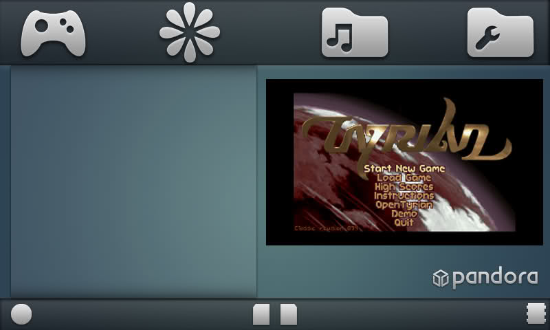
Here's some screen shots:


I've switched to using PNGs for everything, although I'm still not sure what favourites_icon_highlight.bmp is for, so I left that in the ZIP.
I stuck with VeraBd for the big font, as it doesn't seem to suffer from the weird placement thing as much as the other fonts I tried at that size, and I used FreeSans for everything else; I'm pretty sure they're both all cool licensing wise.
Here's some screen shots:


I've switched to using PNGs for everything, although I'm still not sure what favourites_icon_highlight.bmp is for, so I left that in the ZIP.
Trip
Sorry, but I suck at explaining stuff :P
If your trying to get me choosing a new favourite, your off to a good start.(naw)mcx said:Working on this!
Very smooth; like a pint of bitter
Last edited by a moderator:
(naw)mcx
Rotary Wombat
- Joined
- Dec 3, 2005
- Messages
- 2,918
- Age
- 32
- Location
- Aberdeenshire
- Website
- www.godlikemcx.deviantart.com
Thanks for the kind words, Tripmonkey!
dflemstr
It's a ball.
Awesome, very clean. Reminds me of those old slate UIs (which devices had those again? I can't remember).(naw)mcx said:
Thanks for the kind words, Tripmonkey!
The buttons might look better if they are packed together on one side instead of evenly distributed, but it might look great as is depending on how you create the tab highlights.
Last edited by a moderator:
(naw)mcx
Rotary Wombat
- Joined
- Dec 3, 2005
- Messages
- 2,918
- Age
- 32
- Location
- Aberdeenshire
- Website
- www.godlikemcx.deviantart.com
like this, dflemstr?
Trip
Sorry, but I suck at explaining stuff :P
You might want to swap the time to the other side MCX.
People tend to be used to looking at the lower right for the clock due to using Windows computers for so long
People tend to be used to looking at the lower right for the clock due to using Windows computers for so long
(naw)mcx
Rotary Wombat
- Joined
- Dec 3, 2005
- Messages
- 2,918
- Age
- 32
- Location
- Aberdeenshire
- Website
- www.godlikemcx.deviantart.com
Thanks Tripmonkey, change has been put in place.
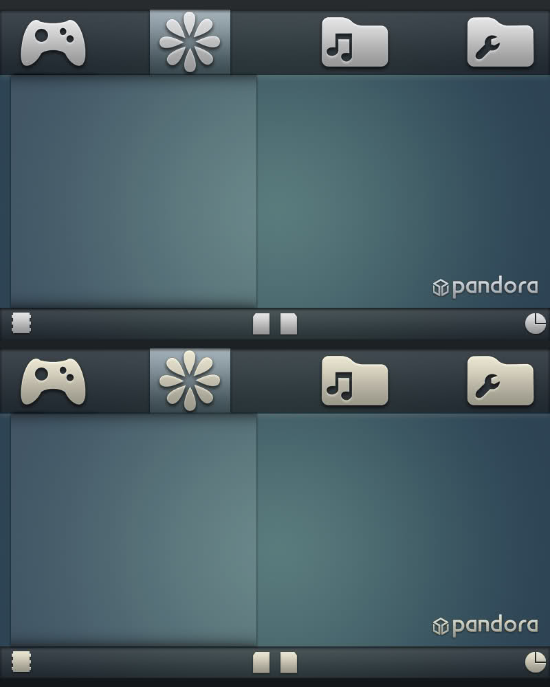
Now I pose you all with a question. What looks better. The normal version. Or the version with yellow tinted stuff?

Now I pose you all with a question. What looks better. The normal version. Or the version with yellow tinted stuff?
Trip
Sorry, but I suck at explaining stuff :P
No probs.(naw)mcx said:Thanks Tripmonkey, change has been put in place.
Now I pose you all with a question. What looks better. The normal version. Or the version with yellow tinted stuff?
Can't tell I'm afraid. White on my laptop tends to look a little yellow anyway.
I would hazard a guess though and say that the icons would look better if they were less grey.
That help at all? :blink:
Last edited by a moderator:
(naw)mcx
Rotary Wombat
- Joined
- Dec 3, 2005
- Messages
- 2,918
- Age
- 32
- Location
- Aberdeenshire
- Website
- www.godlikemcx.deviantart.com
Tripmonkey_uk said:No probs.(naw)mcx said:Thanks Tripmonkey, change has been put in place.
Now I pose you all with a question. What looks better. The normal version. Or the version with yellow tinted stuff?
Can't tell I'm afraid. White on my laptop tends to look a little yellow anyway.
I would hazard a guess though and say that the icons would look better if they were less grey.
That help at all? :blink:
Haha, it does a bit.
I had this problem with my friend, I kinda forgot he was colour blind
Last edited by a moderator:
CoMiKe
Member
IMHO, the white version looks better.
A little suggestion. Spacing does a lot for a good experience. I mean, the kind of flower that is selected on top does not have enough vertical space in relation to the top bar. I believe you should shrink it so it has the same vertical spacing as the rest of toolbar icons.
Anyway, the skin looks pretty beautiful. I'm sure it will be a favorite of mine.
MCX; yellow tint is warmer but the whiter one the colors fit better. I love its simplicity btw 
Cpasjuste: you might know already but .. you might want to add a sleep(1) or something in your main render loop, I just noticed it takes all my CPU just to refresh a clock, and i'm sure ppl would appreciate if an app launcher didn't eat all the batteries
Cpasjuste: you might know already but .. you might want to add a sleep(1) or something in your main render loop, I just noticed it takes all my CPU just to refresh a clock, and i'm sure ppl would appreciate if an app launcher didn't eat all the batteries
after some more work, i updated the skin to fit the new version  I also tried to find a suitable font but they all seem very deformed when displayed in pMenu
Both Free, Nimbus or Liberation. In the pic i'm using Liberation, it's the less messy of them.

Both Free, Nimbus or Liberation. In the pic i'm using Liberation, it's the less messy of them.

(naw)mcx
Rotary Wombat
- Joined
- Dec 3, 2005
- Messages
- 2,918
- Age
- 32
- Location
- Aberdeenshire
- Website
- www.godlikemcx.deviantart.com
I'm sure that some one was asking for a free Helvetica-alike
http://www.zvr.gr/typo/mgopen/index
That might answer your question
I also can't get pmenu to work - just doing what the thing says!
http://www.zvr.gr/typo/mgopen/index
That might answer your question
I also can't get pmenu to work - just doing what the thing says!
fusion_power
Advanced Member
I don't think someone evil guy "out there" will ever find our Pandora and check, what Fonts we use. :lol: Nobody cares about fonts right?monkeyo2 said:I've uploaded my skin, and I called it DarkMonkeyo, which the best thing I could think of at the moment, although I don't think it's a very good name. (I'm more of a visual person than a naming things person; any better suggestions would be appreciated! I'll try and come up with something else).
I stuck with VeraBd for the big font, as it doesn't seem to suffer from the weird placement thing as much as the other fonts I tried at that size, and I used FreeSans for everything else; I'm pretty sure they're both all cool licensing wise.
I like the black skin, I hope it will also look good onto the real Pandora Screen. One thing: maybe you can try to make the A and B Button icons in the confirm window more visible, black over black is not the best contrast. Maybe the background could be lighter or maybe the buttons could wo you always can see clearly which Buttons you have in choice.
Last edited by a moderator:
Similar threads
- Replies
- 46
- Views
- 11K
- Replies
- 21
- Views
- 7K

