Gpfce Skin Pack V1.0


xythen

Still Fresh
Joined
Jun 5, 2006
Messages
67
Age
38
Location
Scotland
Website
metalvania.blogspot.com
This is my first contribution in a long time! A full readme is included in the zip, but here are the main points:

Here are 9 menu background images for the emulator "gpfce" for the GP2X. All images are based on the title screens of actual NES games, keeping as true to the originals as possible. The following games are used:

- Blue Shadow & Shadow of the Ninja
- Castlevania
- Ghosts 'n Goblins
- Mega Man II
- Metroid
- Super Mario Brothers 3
- Sweet Home
- Ultima III - Exodus
- Zelda II: The Adventure of Link
[cut]
NOTE: All the original images were taken using the "RealityC.pal" palette, developed by AspiringSquire, which gives the "truest" reproduction of the original NES colours. I have included this palette (along with versions A & B for completeness) in the "_Palettes" folder, with the original readme by AspiringSquire explaining the methods used.
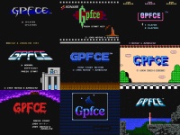
previewser9.th.png

And the originals:


***Download link***

All comments, suggestions and requests welcome! :)[/cut]
 
here's a quick comparison picture:

palettecomparisonqr7.th.png

As you can see there is a huge variation between palettes for many emulators, most of them being extremely garish and not very accurate (the fceultra one certainly isn't the worst I've seen).

The RealityC palette gives the best overall reproduction, but certain games look better with the RealityA one, such as Super Mario Bros 1, because it has stronger blues.

EDIT: See below for better comparison shots.
 
Ok, here's a more thorough palette comparison (that wasn't hurriedly done at 2 in the morning! :p)


This compares the FCEUltra default palette against 2 other popular emulator palettes (Nestopia and Nesticle), as well as the RealityA and RealityC palettes. As you can see blues and greens tend to be the most misrepresented colours, so games which use these colours a lot (Super Mario Bros., Final Fantasy, Contra etc.) tend to see the biggest benefits from the Reality palettes.

Hope that helps!
 
Am I the only one thinking that the Nesticle palette looks best in comparison? oO (I don't mean accurate, but best looking)
 
Digitalrat said:
Am I the only one thinking that the Nesticle palette looks best in comparison? oO (I don't mean accurate, but best looking)
if it looks better to you, than it IS better. any attempt to explain things otherwise will get you into the mental quicksand that is color calibration.

but if you're curious....
http://board.zsnes.com/phpBB2/viewtopic.php?t=3298
kind of an interesting read but painful in a sisyphisian way :D

for a related but much bigger problem:
http://en.wikipedia.org/wiki/CMYK_color_model
see the "conversion formula" at the bottom? complete and utter bullshit. (someone on the the talk page knows it, probably because like me he has actually worked in printing. but he's shouted down by the "author"). it's nowhere near as bad of an error to try and come up with a perfect nes palette, but they kind of smell the same if you catch my drift.

why? first of all, because ntsc & pal do not use the rgb system.
http://nesdev.parodius.com/NESTechFAQ.htm#ispalettergb

here's a really good article that gets into the technical side of things.
http://nesdev.parodius.com/bbs/viewtopic.php?t=1071

final thoughts:
- when i played nes as a kid, i used the rf hookup. now if i play it i use the composite. the colors are very different on the two. going off memory, i would say the nestopia palette looks the best to me.
- these will look much different on your gp2x screen is going to look much different than your monitor. going of that, i'd personally pick realityA, even though it looks too dark/saturated on my monitor.
- the colors of pixels put out by the nes display hardware actually change depending on their neighbors. (edit: i should mention that this is because they are not actually pixels, but scanlines with colors that shift along their length, sent via analog signal). not subjectively, but as an actual function of the hardware. so, again, there's no perfect palette, just whatever looks good to you at the moment. i don't even mess with them because i'm too anal and once i start i won't be satisfied until i make my own :ph34r:
 
Last edited by a moderator:
rokdcasbah said:
Digitalrat said:
Am I the only one thinking that the Nesticle palette looks best in comparison? oO (I don't mean accurate, but best looking)
if it looks better to you, than it IS better. any attempt to explain things otherwise will get you into the mental quicksand that is color calibration.

but if you're curious....
http://board.zsnes.com/phpBB2/viewtopic.php?t=3298
kind of an interesting read but painful in a sisyphisian way :D

for a related but much bigger problem:
http://en.wikipedia.org/wiki/CMYK_color_model
see the "conversion formula" at the bottom? complete and utter bullshit. (someone on the the talk page knows it, probably because like me he has actually worked in printing. but he's shouted down by the "author"). it's nowhere near as bad of an error to try and come up with a perfect nes palette, but they kind of smell the same if you catch my drift.

why? first of all, because ntsc & pal do not use the rgb system.
http://nesdev.parodius.com/NESTechFAQ.htm#ispalettergb

final thoughts:
- when i played nes as a kid, i used the rf hookup. now if i play it i use the composite. the colors are very different on the two. going off memory, i would say the nestopia palette looks the best to me.
- these will look much different on your gp2x screen is going to look much different than your monitor. going of that, i'd personally pick realityA, even though it looks too dark/saturated on my monitor.


Worked in printing? Right on brother, the power of the press only belongs to the man who knows how to run one!
 
Last edited by a moderator:
here's a quick way to see what a palette based system is missing (right side is a filter that approximates ntsc artifacting based on the spec):

http://blargg.fileave.com/ntsc-vs-palette/

it's really obvious in blaster master & metroid. the developers knew what they were doing, too. notice how many more colors the busy backgrounds end up with.

but like i said, if i was that anal about it i'd just fire up the real thing. then again, uqm is my current love affair.
 
cool, I never realised that blargg's NTSC filter had been implemented for the NES too. I've recently been using zsnes with the filter and thought it was really great (completed Soul Blazer with it a few weeks ago :)).

But for the gp2x, palettes are the only real option (the filter uses "40% CPU on a 400 MHz PowerMac G3"...), and plus on such a small screen (which has colour problems anyway) it's not really necessary.

So...6 replies and only 1 even mentions my backgrounds... Maybe I should have released a palette pack instead! :p
 
Good idea, but I never even see the GPFCE background. I launch my roms from gmenu, and once the game is started you never see the background image again.
 
naples39 said:
Good idea, but I never even see the GPFCE background. I launch my roms from gmenu, and once the game is started you never see the background image again.
Argh, all you l33t h4x0rs with your command line launchers :blink:

Oh well, at least I'm enjoying them! :p
 
Last edited by a moderator:
xythen said:
But for the gp2x, palettes are the only real option
completely agree there, unless someone finds a clever way to do just the color bleed...i think it's only horizontal (don't know what the math/convolution term for that is) so who knows.

as far as the backgrounds, i think they're very impressive. my favorite is the ultima: exodus one. the sweet home one is awesome too, although i've never played that game. guess i should try it. looks like you took quite a bit of time to make that hill larger.

some critique:

- the blue/ninja shadow one should probably have highlights on the top left of the letters
- for metroid, i'm not sure why you made lettering that has steps in it, unless other metroid games have that? i would personally just cut the C from the O and the F from the E...since all the curves are the same, you could probably make the P easily. That only leaves the G...aka the fun one :D.

they're all pretty great though. but like naples, i just use gmenu since it's a bit quicker and i have the box art in there.
 
Last edited by a moderator:
Back
Top