Release PNDManager


Looking good! :)


Uh, what I wanted to ask the whole time is, why Milkyhelper has a gazillion rating stars instead of just maximum 5 in the overview window of PND Manager? :huh:
 
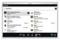
In the next public beta version of PNDManager, could the enter guihint be placed non-scaled next to the textbox, like in the attached image? I would like to see people's reactions to that.

pndm-2012-03-24-search_externalenter.png
 
Last edited by a moderator:
In the next public beta version of PNDManager, could the enter guihint be placed non-scaled next to the textbox, like in the attached image? I would like to see people's reactions to that.

I actually removed scaling for all guihints (after you posted). There seems to be enough space and they look cleaner that way. I currently have the "enter" guihint overlapping the text box a little. Seems to tie it better to the widget instead of just having it next to it. What do you think?


EDIT: Tested on pandora, IMO the default size guihints don't look too big, though I was a bit afraid they would.

pndmanager5.png
 
Last edited by a moderator:
EDIT: Tested on pandora, IMO the default size guihints don't look too big, though I was a bit afraid they would.
I have an extensive testing process in place to make guihints look non-weird by default in as many situations as I can, so one reason for the default size of guihints is that it simply works quite well on the Pandora's screen. The upcoming guihints guidelines actually contain some explicit warnings regarding what you've just written. In other words, no surprises there, for me at least...


What you could also try is to use a transparency edit: opacity of 93% for all guihints (such sentences really make my brain hurt out of sheer progress).

I currently have the "enter" guihint overlapping the text box a little. Seems to tie it better to the widget instead of just having it next to it. What do you think?
If you apply the transparency tip from above, it could surely make sense to put the enter guihint next to the textbox (or inside of it) -- otherwise, in my humble opinion it's probably more a matter of personal preference than anything else, for now at least.
 
Last edited by a moderator:
Cristoph.Krn: All the changes you proposed here are now added to the next release.


Still have some testing to do before I can call it a release.
 
I currently have the "enter" guihint overlapping the text box a little. Seems to tie it better to the widget instead of just having it next to it. What do you think?
I would entirely include it in the bar (at the end).
 
:wacko: That's strange.


MD5: 62bd6d729ae02c8cf4e4c9cf3273eb47


SHA1: 5222667e3923ad421cd6467149e15a94b937061f
 
Last edited by a moderator:
I rebooted, and not only did downloading work correctly now, the connection to bzar.fi was also much faster than it was before.


Strange indeed.
 
Someone has been downloading PNDManager about 2200 times in the last two hours. :huh:


EDIT: Looks like a break-in attempt. They've been banging sshd at the same time. Only to be ip-banned within seconds :p
 
Last edited by a moderator:
One of my favorite Pandora apps is an app management app! :) . I'm going to go grab my Pandora and check out this new beta.
 
I know this has been said before, but a universal menu/launcher based on PNDmanager's interface would be awesome.
 
Last edited by a moderator:
using latest beta pnd on SZfinal, the upgradeable screen is showing me 3 programs which in fact do not need upgrading?
 
I know this has been said before, but a universal menu/launcher based on PNDmanager's interface would be awesome.
If you meant making a launcher with Panorama:


(in case you didn't know) Panorama, which PNDManager runs on, was actually initially designed for that purpose. Basically everything needed for doing such launcher is in place. Before making a serious attempt at this (I've made a few prototypes), Panorama should either lose some weight to run alongside any applications (most memory usage is from Qt libs) or launch faster so it can be killed while the app is running.


Qt5 should help with the slimming down, but it's gonna take a while to release, after which I'll need to port Panorama and any UIs to it. Also since PNDManager is apparently making its way to the firmware in .next, I probably should stick to the Qt version available there.


If you meant making a launcher with appearance/functionality similar to PNDManager:


I agree :p
 
Back
Top