logo idea by comradekingu is logo idea


Maybe something like this to make the Y/R more distinct? (something like, but not exactly that. That is kinda ugly :p )

Lhs7MdK.png
9zuVe4z.png
 
Last edited by a moderator:
You know... I believe it would be possible to retain the symmetry and have the top and bottom points completely balanced if points were not used. Shave off the tips until the horizontal lines that result are completely in line with each other.

Of course some other points (like the conjoined leg of the R and Y) would probably need the same treatment to ensure equidistant lines and spaces.
 
The more cuts you add, the more problems I have seeing the cube in it,

so this one in black or whatever is fine:

9zuVe4z.png


I would reduce the height to the width though, so it becomes less stretched.
 
Last edited by a moderator:
The more cuts you add, the more problems I have seeing the cube in it,


so this one in black or whatever is fine:


9zuVe4z.png


I would reduce the height to the width though, so it becomes less stretched.
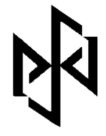
The problem is those triangles... I think the only way to solve the issue of not having a perfectly undistorted cube is to accept that those triangles can't all be uniform in size.
 
The more cuts you add, the more problems I have seeing the cube in it,

so this one in black or whatever is fine:

9zuVe4z.png


I would reduce the height to the width though, so it becomes less stretched.
The word is more important than the cube. IMHO, without the cuts, it's much harder to read. Especially for someone looking at it with no prior knowledge. I'm not saying that every person needs to be able to look at the logo and see "Pyra" right away. But a lot of people should.

-God Ginrai
 
^ Agreed, I like the designs that bring out the lettering of Pyra a bit more.
 
Last edited by a moderator:
1.  Map the 'surfaces' on a cube in a 3d modeling program.

2.  Turn the cube slightly off center.

3.  Add a light source off center so that different facets have different shading gradients.

It should not be 100% symmetric.
 
I don't think it has to be readable. It's just a very nice bonus if there are letters hidden in the logo, and even more so if they are in the right order and an ambigram. But the main task of the logo is to be aesthetically pleasing and recognizable. In most practical uses, i.e. everywhere but on the case embossing, there will also be text, e.g. "DragonBox Pyra" in a nice readable font.
 
It is symmetric, it isnt uniform. It doesnt represent a eucilidian shape, or however one puts it technically.

I found the latest droodle i did, almost went in the oven ;) loosely based on

pyraplegic.png I think it can be made into something. Im using coloured triangle pieces overlapping to show borders, that should provide the 1px borders without being 1px wide. Maybe it will work out.
 
Last edited by a moderator:
I don't think it has to be readable. It's just a very nice bonus if there are letters hidden in the logo, and even more so if they are in the right order and an ambigram. But the main task of the logo is to be aesthetically pleasing and recognizable. In most practical uses, i.e. everywhere but on the case embossing, there will also be text, e.g. "DragonBox Pyra" in a nice readable font.
I'm not saying it needs to be obviously the word "Pyra". I am simply saying that it needs to be something people will at least notice. If you leave everything connected, then the logo really becomes the hexagon with a jumble of lines in it that T4b was talking about.

-God Ginrai
 
Don't want to upset anyone by not making it geometrical, but trying to spark some ideas about showing the letters some more. (the original design is already great btw)

To finish it off I added a dark background to see how the logo would do in brighter colors.

paint_is_great.png
 
Interesting attempt. However, that basically obliterates the ability to see the Y and R in Pyra. Also, even if you could, you couldn't read it upside down like you can the original logo, because you changed the A so that it can't be a P when upside down. Not to mention, the one part you lightened makes a gigantic S that is all I can pay attention to. The Pyra doesn't even have anything to do with the letter S.

-God Ginrai
 
Someone suggested on IRC that we just use a fancy font.. I think that'd be a much better idea and selling the brand, making cases and all that would be easier
 
Has anyone noticed the forum's heading lately?  The Pyra logo should just look like that.  The DragonBox Pyra part that is.

RvVAOkc.png
 
Last edited by a moderator:
Guys, don't hate me for saying this, but , wasn't one of the aims to differentiate the Pyra from the Pandora.  The current Logo design is starting to look a lot like the current Pandora logo.
 
Not really. The Pyra is just not named the Pandora 2 because "Pandora" is something he did w/ Craig. It's still supposed to have ties to the Pandora as a successor. Hence the name Pyra. (for Pyrrha, daughter of Pandora) Also, I don't really see all that much of a resemblance between comradekingu's logo and the Pandora logo.

-God Ginrai
 
Back
Top