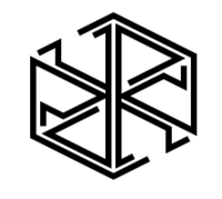
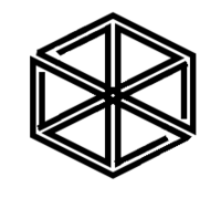
logo idea by comradekingu is logo idea


Too complicated IMO. Logos should be simple and easily recognisable
Funny because I see this as the most simple and easily recognizable of all these cubes.
 
Last edited by a moderator:
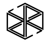
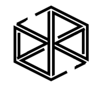
Here is another one, with a separated Y and R for less swastika.

pyralogo2.png
Too complicated IMO. Logos should be simple and easily recognisable
Can you draw the current Pandora logo exactly without looking at it after a night of sleep?  If not then the current Pandora logo is not simple neither.   Simplicity and recognizability are two different things.  It doesn't have to be simple, it just has to be recognizable after you see it once.     
 
Another variation on the theme:

pyralogo3.png
pyralogo3b.png
pyralogo3c.png
pyralogo3c2.png
pyralogo3d.png
pyralogo3e.png
pyralogo3f.png
pyralogo3g.png


(these are all the same design, just with different line widths, colors and line curvatures. source .dia file here: http://people.cs.kuleuven.be/~jon.sneyers/tmp/pyralogo3.dia)

(by the way, I'm drawing all this on my Pandora, it's the only computer I took with me on my holiday, except for an iPad but that's no real computer ;) )
 
Last edited by a moderator:
Yes, I'm still stuck with Kingu's number 32 being my favourite:

post-2326-0-04277300-1390600509_thumb.png


(from page 6 of this thread)

Granted, the top and bottom corners don't line up, but it seems to me that trying to get it symmetrical has led us down the garden path, so to speak. I've not seen anything to better it since we started on that approach.
 
Last edited by a moderator:
First one i think is very summerian for some reason

wbpyralogo3g.png

wbpyralogo4g.png

wbpyralogo5g.png

the most interesting? maybe keep twirling the innards is what could be done to it.

wbpyralogo6g.png

Maybe if the mids were of equal size to the rest.

wbpyralogo7g.png

Too bland an entry, maybe for tiles of some sort.

wbpyralogo8g.png


wbpyralogo9g.png


In summary these are too much of a conceptual collection of artpieces, good in their own right, but more coverart than logo. The concept being a variation on the theme that is already known, which we cant assume, because we are the only ones exposed to the most basic form.
 
Last edited by a moderator:
How about taking logo 5g (third one from top, above currently) and adding in the gaps that give the P and A their tails?

Something like this, although it's just a hand-tweaked copy of 5g, so the anti-aliasing is a bit random, and perhaps the angle of the cut isn't right:
5gl.png
 
Just exploring ideas here, which one of the three sizes did you like the most?  I know "i prefer" "i like" amounts to some scaling of opinion, but its more useful to provide some context if the point of view isn't obvious.
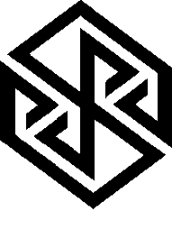
Right now its either polish the C version, or work on the not so explored sketch i have.  Would be nice to be able to make such an embossed version, but i dont know how.
 
Last edited by a moderator:
Back to shared vertical line for Y and R, but with a more obvious cube (box) :

pyralogo5b.png


Of course this is not readable at all to an untrained eye, this is a logo intended to be supplemented with text in a normal font.
 
the most interesting? maybe keep twirling the innards is what could be done to it.
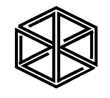
post-2326-0-77174300-1391438442.png


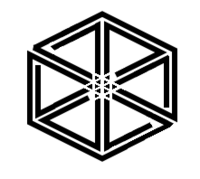
I've stayed away from this thread for obvious reasons but had to pop back in to say I like this one a lot.  It has a sort of M.C. Escher impossible cube look to it, and PYRA can still be seen in it if you know what to look for.  It has my vote!

Of course this is not readable at all to an untrained eye, this is a logo intended to be supplemented with text in a normal font.
If I'm honest, I don't think any logo in this entire thread is immediately readable as PYRA by someone who doesn't know it is supposed to be.  That being the case, perhaps going with a more abstract logo like this "most interesting" one would actually be better?  It's a stylised box with a nice optical illusion / Escher look to it, but the well informed can find PYRA in it.  That to me seems preferable to trying to force the letters into a shape that could be misinterpreted, either for that shape I shall not mention, or for PYRd, Dyhd etc.
 
^ I like this one a lot, but still feel it isn't quite perfect. Something needs to be done. I'll be back home in a couple of days, so will play around with the concept then. I like the direction this is taking...
 
Back
Top