Suggested Pandora Gui - "tango"


Now for a serious attempt at "less eye candy"
2472267451_4bd2db9c12.jpg
Click for big.

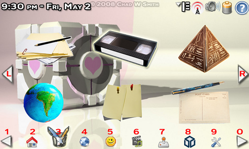
Now, here it is, without tabs, without a background gradient for the center icons, without effects on non-selected icons, without titles ... for anything. Just icons and a labeled controls.

I'm not sure if I like the labeled controls or not - but at least you know what button to press to do what.

The new Smiley is for Communications. I know, it could have been a phone, or a iconized "TXT" or the Skype logo, a radio tower... but I saw a smiley and I used it. sue me.

Better? Worse? Happy? Sad?

BTW - the Tabs are on the bottom so they are easier to click. And, if you have never seen a GUI that put tabs along the bottom, then you've never used Mac OS 9 or earlier. In fact, the tabized folder buttons were so missed by many Mac users, that numerous apps exist to recreate the functionality. You could "Tabize" any folder, directory, or drive just by dragging an open window to the bottom or sides of your screen.

click for classic Mac desktop with tabs on the bottom right
 
Svartalf said:
Until you have a more functional mock-up (Do you have something in Python for N800 that I and others could tinker with??) that people can duff about with that does little more than tabbing over, button clicking, etc. you can't tell if you've made any oopses- it looks right to me, so I think this is going to probably be a winner...but until you implement the thing just a little bit further to get interplay, you can't be for certain it's usable. :D
I'd love to apt-get you the deb binary that I compiled for the ARM chipset on the maemo-python testing rig. I set the kernel panic to fsck the RPM man but, my source got hung in the bindings of a bash command and the lag from the buffer overflow caused an illegal function and performed a fatal error, while I was defragging the full duplex to lower my RTT and latency. Of course, this resulted in massive catastrophic packet loss, and, ultimately - the peguin died. It was very sad. The memorial service is on Thursday. He is survived by Mrs. Tux and 27 eggs.

That said - I don't know how to code anything. I'm a designer, not a programmer. The last program I wrote was a text based adventure story written in QBasic back in 1985. "Do you pick up the flashlight? (Y/N)" If $FL = Y, goto 270..." However, I'd love to send you the layered photoshop files I have! :) Or, I could send those to anyone who would like to turn them into some sort of functioning whatsit.
 
Last edited by a moderator:
Better? Worse? Happy? Sad?


I think it's a step backward :(

I liked the tabs actually being tabs. The numbering certainly gives an idea of how to control the interface but looks kind of ugly. Perhaps you could have it as an overlay which popps up when you hold down F1?

Lastly, the background picture is kind of fighting with the icons. I think by defaul the background picture shouold be set to 50-60% brightness. Obviously this can be user configurable, but by setting it to be darkened by deafault it will make the icons stand out a bit better.
 
Last edited by a moderator:
The transparent background gradients helped a lot, bring them back. Tabs also are easier to see, you could add a small number in a corner of the tab, since once the user figures out numbers work looking at them isn't always necessary (they're likely be just above the number keys anyway).
 
Ok - taking your comments into the new mockup. Tabs are back (although I would like to hear what those who were complaining about them think of the mockup without them) - but now they are not the color of tombstones, so maybe that will help. Control hints are more subtle and moved. I darkened the background and added back the buffer gradient to help the icons stand out. I also labeled the icons, and made them actual programs - except I only used three of them, becuase finding and labeling more icons won't really help anyone see functionality, and I'm lazy.


Here is the new/old tabized Apps tab in the Grid mode.
2473954094_c92a1eabfd.jpg
Click for big


btw - ot - I *HATE* BBCode! HTML is a billion times better!
 
Last edited by a moderator:
cb88 said:
tabs = good
the transparent background to the icons not so good. it makes the users background hard to see.
On the other hand, it makes the icons themselves a LOT easier to see. And if you're moving around to choose an icon, surely those are what you primarily need to see.

That said, I could see some coolness in having the background, icons and all, fade after 10-15 seconds without use. Especially if there were a function to have a slideshow mode for the background (i.e. just goes through folder of images changing them a la many screensavers).

However, such things are going well beyond the intent of the gui i.e. to provide something not overly complex that nonetheless lets you do everything you need to. And of course, they'd also mean more CPU power in use when idling than a static background would need...
 
Last edited by a moderator:
chad78 said:
Ok - taking your comments into the new mockup. Tabs are back (although I would like to hear what those who were complaining about them think of the mockup without them) - but now they are not the color of tombstones, so maybe that will help. Control hints are more subtle and moved. I darkened the background and added back the buffer gradient to help the icons stand out. I also labeled the icons, and made them actual programs - except I only used three of them, becuase finding and labeling more icons won't really help anyone see functionality, and I'm lazy.
Here is the new/old tabized Apps tab in the Grid mode.
2473954094_c92a1eabfd.jpg
Click for big


btw - ot - I *HATE* BBCode! HTML is a billion times better!


Yea I like that one a lot more. :)
 
Last edited by a moderator:
I'm beginning to question the usefulness of the arrows on 1 and 0. It may be more intuitive if those tabs never moved (when used, should be movable from a config menu) so that for example 3 always points to the web browser.

Also, the transparent gradient is great. The background picture is much less important than actually seeing what you click/touch.

This is starting to shape up nicely.
 
sindbad said:
I'm beginning to question the usefulness of the arrows on 1 and 0. It may be more intuitive if those tabs never moved (when used, should be movable from a config menu) so that for example 3 always points to the web browser.

Also, the transparent gradient is great. The background picture is much less important than actually seeing what you click/touch.

This is starting to shape up nicely.
The <1 and 0> arrows are there for people who requested user definable tabs. I'll try to explain better how this works. Remember, the name of the game is "pages" - that's the theme I'm working with.

So, while you are on this "page" of tabs - the 2 button will always be Home - the 3 button will always be Apps - the 4 button will always be Web, etc.

When you hit 0 - all of the tabs will change (although, I really think that Home, and maybe preferences should be on every page, IMHO). and you get 8 (or, if Home and Pref stay - 6) new tabs.

So let's do this:

Tab Page 1:

1. Last Page
2. Home
3. Apps
4. Web
5. Communication
6. Media
7. Emus
8. Pandora
9. Prefs
0. Next Page

Tabs Page 2:

1. Last Page
2. Home
3. Favorites
4. Mini Games
5. Hacker Tools
6. Office
7. Travel
8. Empty*
9. Prefs
0. Next Page

*(Blank Tab - I think there should always be 8 tabs and two arrows, even if there is only 3 used tabs on a page - it gives consistency to the GUI, and makes it easier to code.)

So, the arrows to slide the tabs over one, they completely change the list of tabs. So Home will always be assigned to the 2 button. Make sense? Good idea, bad idea? Thoughts, questions, snide remarks?
 
Last edited by a moderator:
OpenTheBox said:
I like the GUI, it's user friendly.

I might be in a minority here, but I would like to see the F# keys to be a quick way to launch EMUs.
I want to boot up my Pandora and hit just one (or combo) key and it will take me straight to an EMU's start screen.
Thanks. And now, after adding the tab = number key concept, from a cold boot, you'd just hit the number 7, and your emu screen is up and running.
 
Last edited by a moderator:
chad78 said:
So, the arrows to slide the tabs over one, they completely change the list of tabs. So Home will always be assigned to the 2 button. Make sense? Good idea, bad idea? Thoughts, questions, snide remarks?
Yeah, I get it now.

But I still think keeping it simple is better. If a user wants a gazillion tab pages, that user can probably remember a key combination to change the tab page or directly start some specific app. It's possible that some not-so-tech-savvy users will accidentally press 1 and get lost.

There could also be a configuration tool from where you can customize what tabs are shown and how you switch between tab pages. Something like editing toolbars. And there could be dedicated tabs for switching tab pages that you can place yourself where your heart desires (some users may want to switch pages with 9 and 0).
 
Last edited by a moderator:
sindbad said:
But I still think keeping it simple is better. If a user wants a gazillion tab pages, that user can probably remember a key combination to change the tab page or directly start some specific app. It's possible that some not-so-tech-savvy users will accidentally press 1 and get lost.
In my vision of things, the simple end user that doesn't add any tabs won't need to fear. If they accidentally hit 1 or 0 - nothing with change. If you have only 8 tabs - you have only 1 page of tabs. Maybe the arrows are not visible if you have only 8 tabs, and, again, the 1 and 0 would do nothing. Would that keep things simple enough?

QUOTE

There could also be a configuration tool from where you can customize what tabs are shown and how you switch between tab pages. Something like editing toolbars. And there could be dedicated tabs for switching tab pages that you can place yourself where your heart desires (some users may want to switch pages with 9 and 0).


Well, if we have editable tabs - there would have to be some sort of tool for that. Making it possible to move the navigation around though, that requires (I imagine) more work for the programmers - more code for the system to run - more confusing preferences for the user to deal with (see my previous comment about the Tyranny of choice), and deludes the consistency of the GUI.

And that last point isn't some sort of ego thing, like I want users to do things the way I say or not at all - hopefully I've shown that I am open to suggestions and stuff. This is no longer my GUI - I've learned so much from the people on these threads that I feel like its OUR GUI. I just happen to be the guy with Photoshop.

No the consistancy of the GUI is important from a user standpoint. Having the arrows always appear in the same place is important for GUIs designed for non-touch screen software - how much more so for touchable GUIs?

That said, I'm open to suggestions.

Also... and this is important...

ATTENTION ANYONE WHO KNOWS HOW TO CODE

Specifically in Python. It has been requested that I present a working demo of this GUI, for possible use on the Pandora! But I have to have the demo so we can work out the bugs. If you are qualified and interested - or if you aren't qualified but are willing to give it a shot! - please let me know, either here or by PM or through email - chad78 - at - gmail - dawt - com

Thanks!

Karel Jansens said:
1. I don't know if this is feasible, but couldn't the bottom tabs be aligned with the number keys of the Pandora's keypad? That way it would be rather easy to assign a <FN>+<NUMBER> combination to each tab. You know, for the touchscreen-impaired.
Done! :)

QUOTE

2. I'm still a big fan of a tile-based layout, mainly because it removes the ambiguity of where the clickable zone for an icon ends, so instead of having loose icons in the grid-based layout, perhaps true tiles (you know, with outlines) could be used. It's probably visually less appealing, but I'm betting it'll score big in the usability area.


I'm working on a mock-up now. That might settle the "I can't see the background" vs. "I can't see the icons" debate. There is obviously a need to make it clear what's an icon and what's not, so I'll try it.

QUOTE

3. Please, if possible, no kinetic scrolling! It really drives me nuts on a small screen (and is the main reason why I don't use Canola on my N800!). Gesture scrolling, especially on the slider layout, might work, but I'd seriously urge you to make it a user-definable setting.


Please pardon my ignorance, but what do you mean by "kinetic scrolling"? Do you mean you *don't* want to be able to tap the arrows and change the page? I guess the easiest compromise between those who want to use the touchscreen to navigate and those who do not would be a "No Touch" option for the GUI. Or a "Tab / Gesture / No Touch" option thing. What do you think?

QUOTE

As to the rest: Kudos on taking the good bits of Maemo and leaving out the lousy bits. Just make sure the top-right toolbar is expandable and user-accessible, that the home widgets are resizeable and can be locked in place and that there is an easy way to go in and out of fullscreen mode (i.e. without tabs and widgets).


if only there were some sort of button - maybe on the top of the box, that could do that for us.... ;) Coyly says the N800 user....

QUOTE

Actually, this is a good place to find out what's wrong with Maemo from a usability point of view. Obviously, the Newton-specific points are less important, as the Pandora is not a handwriting-centric pocketable, but there's some very good stuff in there.


I love that article. Well, the parts of it I have read. It's pretty long, and the first time I looked at it, I had no more interest in it than as a N800 user - but now that I'm working on a GUI, it takes on more meaning. Especially the stuff about making icons clear in their meaning and distinct from each other.
 
Last edited by a moderator:
chad78 said:
In my vision of things, the simple end user that doesn't add any tabs won't need to fear. If they accidentally hit 1 or 0 - nothing with change. If you have only 8 tabs - you have only 1 page of tabs. Maybe the arrows are not visible if you have only 8 tabs, and, again, the 1 and 0 would do nothing. Would that keep things simple enough?

A user that doesn't need tab pages and uses just one line of tabs could still benefit from those two extra tabs. This default might need some extra thinking/debating.

chad78 said:
Well, if we have editable tabs - there would have to be some sort of tool for that. Making it possible to move the navigation around though, that requires (I imagine) more work for the programmers - more code for the system to run - more confusing preferences for the user to deal with (see my previous comment about the Tyranny of choice), and deludes the consistency of the GUI.
It's not really hard to code for that. It doesn't have to be 'live editing of tabs', just a list of the tabs where you can change positions and insert things. Even live editing might be easy enough, depending on design.

Editing tabs can be hidden in some sort of Advanced config area.

chad78 said:
No the consistancy of the GUI is important from a user standpoint. Having the arrows always appear in the same place is important for GUIs designed for non-touch screen software - how much more so for touchable GUIs?
Consistency is very important indeed. Sane default stuff are mandatory, without any way to accidentally change them. Most people that want more advanced things can live with the incosistencies and the harder to reach config options.

I'd love to code it myself but I don't have any bloody time.
 
Last edited by a moderator:
I don't especially like the numbers on the tabs, maybe they would be transparent by default, but could be turned on if a button on the keyboard was pressed. (Alt? It performs a similar function in Windows - selecting the menu of the running window for keyboard input - possibly Linux as well, I don't remember.) This could also be a checkbox in the GUI's settings.

Couple of other things:

1) Some sort of faded background behind the icons is necessary, gradient or solid. The background image is a nice thing to have, but usability IS the most important thing here.

2) In terms of seeing the background, there could be a button that would hide the icons - you would only see the top bar, the background, and the tab bar at the bottom. Pressing down on the D-Pad might work here.

3) IMO, it would be nicer not to have "blank" tabs along the bottom of the screen. If a user only had 11 tabs, the second page of tabs should just have the three tabs and the two arrows on the sides, with those 5 objects centered in the bottom of the screen. From a coding standpoint, this shouldn't be very difficult, as all one would need to do would be multiply the number of objects by the space required for an object, subtract that from the screen width (800px), and divide by two. That would give the left x-coordinate for the left arrow, and the drawing of the objects would just proceed from there. Definitely looks nicer that way.

4) It's shaping up nicely! Keep up the good work! I'm interested in seeing an executable demo of this. :D
 
IF this becomes the GUI for Pandora I'd buy one just because of that because that is just down right pretty looking, All we need now is a coder with time on his/ her hands
 
Yep, that's exactly the kind of thing I was thinking and it would be pretty easy to do in Graphics View.

The only thing I'd want to add is animated icons. Instead of the game cover, you have a short repeating clip of in-game action. The active app picker can also preview windows like Win+Tab on Vista.

Very nice!
 
Tom Cooksey said:
The only thing I'd want to add is animated icons. Instead of the game cover, you have a short repeating clip of in-game action. The active app picker can also preview windows like Win+Tab on Vista.
Expanding on that idea, in the emulator Gens32, there's a ROM explorer. When you scroll over the specific game, it plays the game in a little box at the side. If someone wanted to go to the effort, you could incorporate this into each emulator, just using a random game in the ROMs folder.

Of course, this would probably be a lot of work for a little eyecandy. :D
 
Last edited by a moderator:
Back
Top