Suggested Pandora Gui - "tango"


Sphinxter said:
I find the drawings a bit illogical, looks like those are upside down and taped on the bottom of the pages or something weird, tabs always go at the top of every tab interface I've used but I don't get out much, more like tombstones in the dirt. Bit too much clutter, white space is one of the most important design elements, might look better with a couple pixel bigger more visible icons without the headstones, their transparency adds to the clutter.
On a touch screen it is advantageous to place frequently used interaction areas—e.g. menus—along the bottom, or to the right. This means that the user will not be obscuring the screen when touching the menus.

But yes, they are upside down which breaks the tabbed pages metaphor.
 
Last edited by a moderator:
chad78 said:
The <1 and 0> arrows are there for people who requested user definable tabs. I'll try to explain better how this works. Remember, the name of the game is "pages" - that's the theme I'm working with.

So, while you are on this "page" of tabs - the 2 button will always be Home - the 3 button will always be Apps - the 4 button will always be Web, etc.

When you hit 0 - all of the tabs will change (although, I really think that Home, and maybe preferences should be on every page, IMHO). and you get 8 (or, if Home and Pref stay - 6) new tabs.

<snip>
</snip>

So, the arrows to slide the tabs over one, they completely change the list of tabs. So Home will always be assigned to the 2 button. Make sense? Good idea, bad idea? Thoughts, questions, snide remarks?
Although I have nothing against using the numbers to select tabs, I think it would be a positive move to not have to rely on them.

I would imagine that if a user were to be holding the Pandora (and not using the keyboard) their thumbs would be over the d-pad and the 4 action-buttons, and index fingers over the shoulder buttons. Making navigation possible with just these controls would make it more user friendly. How about; shoulder buttons cycle through tabs/pages/whatever, d-pad navigates through the on-screen panel of icons (which could potentially scroll/page). The primary action button (probably the bottom) one selects.

The number-navigation strategy could still be incorporated, but used as a secondary approach.

What the action-buttons do should be pretty consistent throughout the GUI and Pandora-specific interfaces.
 
Last edited by a moderator:
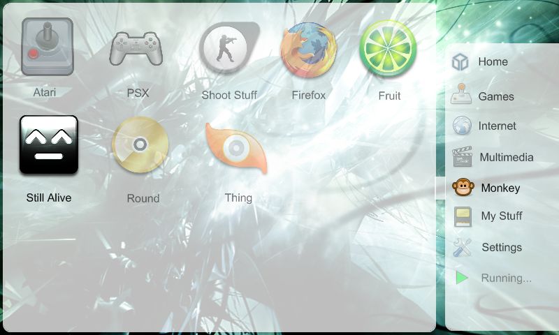
How about something like this:

2483580961_2edda16cf3_o.jpg


(images etc indicative, icons come from Tango icon library, and deleket of www.deviantart.com)

The right-hand navigation menu comes with some standard categories and programs. The user can add/remove/rename/re-order them and move applications between categories. Essential programs/categories either cannot be removed, or are v.easy to restore. Navigation between the categories is achieved via the shoulder buttons; left goes up, right goes down. The list scrolls if there are more categories than can be displayed. If the categories don't fit on screen there will be an arrow indicating that more are available. The menu can be iconised; only the icons show, which reduces the space the menu takes up. The currently selected category is highlighted (as shown / a glow / coloured panel behind it / selection box).

Each category has a page. The page contains icons which are launchers for applications, or if possible will also include dashboard-widgets. Icons/widgets take up set space, so if dashboard-widgets are used they would have to be x-icon-space * x-icon-space in size. Users can add/remove/rename/re-order and move the icons between categories. Installation of a new application would preferably place its launcher in a standard category Navigation in the page is achieved with the d-pad. The current location/selection within the page is highlighted in exactly the same way as with the navigation menu.

The top right (or other reserved area) is used for important status information (e.g. low battery warning).

The menu can fade away / close / minimise to iconised state, so that the background (or static image of currently running application?) can be seen.

The running category is used to manage running applications.

Nothing should be so small it cannot be prodded with a finger.

Some unobtrusive sounds would enhance the usability.
 
Tinman said:
I would imagine that if a user were to be holding the Pandora (and not using the keyboard) their thumbs would be over the d-pad and the 4 action-buttons, and index fingers over the shoulder buttons. Making navigation possible with just these controls would make it more user friendly. How about; shoulder buttons cycle through tabs/pages/whatever, d-pad navigates through the on-screen panel of icons (which could potentially scroll/page). The primary action button (probably the bottom) one selects.
A couple of things - first, the number row is above the game controls - so you don't have to move your hands to use the number keys - second - you can always tap the tab you want.

The problem with your set up is that there are not enough levels. You can have multiple pages within one tab. So if L & R scroll through pages, and the D-Pad moves the cursor on the screen - how do you change tabs? I guess Select or Menu could be used - but that, to me, is not much different than having to use the number keys. At least with the number keys you do not have to go tab by tab - you can jump right from the first tab to the last one, or the next to the last one in one move.

QUOTE

The number-navigation strategy could still be incorporated, but used as a secondary approach.

What the action-buttons do should be pretty consistent throughout the GUI and Pandora-specific interfaces.


I agree with that wholeheartedly.
 
Last edited by a moderator:
Tinman said:
On a touch screen it is advantageous to place frequently used interaction areas—e.g. menus—along the bottom, or to the right. This means that the user will not be obscuring the screen when touching the menus.
Indeed.

Ironically (but in hindsight rather predictable) Nokia designed the O/S for their Internet Tablets with all the control buttons top and left. You gotta laugh really...
 
Last edited by a moderator:
The problem with your set up is that there are not enough levels. You can have multiple pages within one tab. So if L & R scroll through pages, and the D-Pad moves the cursor on the screen - how do you change tabs? I guess Select or Menu could be used - but that, to me, is not much different than having to use the number keys. At least with the number keys you do not have to go tab by tab - you can jump right from the first tab to the last one, or the next to the last one in one move.


Shoulder buttons for the 'tabs', d-pad to navigate within and between the pages.
 
Last edited by a moderator:
Tinman said:
How about something like this:

2483580961_2edda16cf3_o.jpg


(images etc indicative, icons come from Tango icon library, and deleket of www.deviantart.com)
Very cool looking

QUOTE

The right-hand navigation menu comes with some standard categories and programs... <sip>


I first started with a left hand column of categories. It was suggested that I switch to tabs.


QUOTE

Each category has a page.


What if I have more programs in a category than there is room for icons on that page? I might have 25 emulators - but only enough room for 20 icons on one page. That's why I say there are not enough ways to navigate without using the numbers. There needs to be a second tier - a set within a set - or otherwise you end up with a ton of tabs/categories/whatever. (emu1 emu2 emu3 web1 web2 office communication1 comm2 pandora1 pan2 pan3 etc.)

It's the classic balancing act for user interface - shallow but wide navigation - or deep but narrow navigation. In other words...

First Choice
* item 1
>sub a
>sub b
>sub c
* item 2
>sub a
>sub b
Second Choice
* item 1
>sub a
>sub b
>sub c
* item 2
>sub a
>sub b

- versus -

First Choice
* item1a
* item1b
* item1c
* item2a
* item 2b
Second Choice
* item1a
* item1b
* item1c
* item2a
* item 2b

I tried to make it balanced. From cold boot to application in 3 taps/clicks or less.

QUOTE

Nothing should be so small it cannot be prodded with a finger.

Some unobtrusive sounds would enhance the usability.


I agree.

Tinman said:
Shoulder buttons for the 'tabs', d-pad to navigate within and between the pages.
Within *and* between? So you have to hit right like 6 times to get to the next screen?

I'd much rather do it the numbers way.
 
Last edited by a moderator:
chad78 said:
A couple of things - first, the number row is above the game controls - so you don't have to move your hands to use the number keys - second - you can always tap the tab you want.
A quick paper mock-up suggests that I would not be able press to the number 6 button without moving my hands from the optimal game-control position, and *might* have a problem with the 5 and 7 buttons. Its only a mockup though (and I'm sure that the controls have been designed to accommodate 5-95 percentile hand sizes in the intended user base), and may not have much/any impact.
 
Last edited by a moderator:
funny still alive icon XD

im not a lefty but they will want the menu on the left not the right should be selectable... personally id rather have it on the left anyway
 
This other alternative gui that hijacked another thread has the advantage of allowing text to be seen clearly on the tabs.
 
Here's another Pandora UI mockup.

pandorauirightbi0.png
<--- --->
pandorauileftei7.png


The first one for right-handed people, the second one for left-handed ones (it should be configurable on the "Settings" section).

I would like the Home section to contain a colour-configurable calendar and a box containing the tasks programmed for the next 7 days or so.

It could also contain icons for the most used or most recent applications.

The rest of sections should be self-explanatory (except "Desktop", that means desktop applications, not an option to show the Desktop).

The bottom bar would show the currently running applications.

It should be totally operable using the keyboard or the touchscreen (and the use of one of them not requiring the use of the other).

In fact, I would like to try and write it myself, but I'm not very used to X-Windows programming and it will take me some time (a lot, I think) to learn all the things I would need to.
 
CoMiKe said:
In fact, I would like to try and write it myself, but I'm not very used to X-Windows programming and it will take me some time (a lot, I think) to learn all the things I would need to.
You can try customising enlightenment. If you want to write an environment from scratch, I suggest the matchbox window manager, a toolkit (qt/gtk) and an easy language (python/ruby). Programming directly on X is painful.
 
Last edited by a moderator:
Thanks for the info, sindbad. Matchbox looks nice, and I will take a look to Qt and GTK to see what they can offer.

Oh, I will also check how customizable enlightment can be. It should be a lot faster than writting anything myself. :)
 
CoMiKe said:
Thanks for the info, sindbad. Matchbox looks nice, and I will take a look to Qt and GTK to see what they can offer.
It just hit me, it might be much easier/quicker to take a KDE4 desktop and make plasmoids(small desktop apps, like dashboard widgets) for the bar at the bottom and the menu on the side.

In KDE4 the taskbar is a plasmoid, so it might not even require too much modification. Plasmoids can be written in a ton of languages, even javascript.
 
Last edited by a moderator:
But KDE4 is a little (as in "a lot") overkill for a system like Pandora.

Or can we just reduce it to a base KDE system with only a pair of plasmoids?

Even so, KDE4 would be too heavy for the Pandora.
 
CoMiKe said:
But KDE4 is a little (as in "a lot") overkill for a system like Pandora.

Or can we just reduce it to a base KDE system with only a pair of plasmoids?

Even so, KDE4 would be too heavy for the Pandora.
KDE4 is much smaller and efficient than 3 and it runs happily on the Openmoko Neo. We just need kwin and plasma. We also get a lot of stuff already done (office suite, IM, PIM, browser) and the power of KIO slaves just a compile away.
We might even get compiz-like effects from the new kwin if someone either ports it to ES or the mystical GL-to-GL ES translator shows up.

It could still be too large for the pandora, but it's very easy to make a mockup that people can test on their computers as a livecd.
 
Last edited by a moderator:
Back
Top