Finding a proper name and logo :)


I like the new Y, it's much more legible. :)

I agree with the idea of putting those two together.  I think I'd like to see the two stacked though, rather than side by side,  and the Pyra graphic scaled down a bit.

Am I really the only one who thinks that that DragonBox logo would look better with a head though?

- Neelix
 
Just when you mentioned your new [Y], I realised the dragonbox logo looks a bit like one too with the wings/tail [4th below]

2dbm92w.png


I like the new Y, it's much more legible. :)

I agree with the idea of putting those two together.  I think I'd like to see the two stacked though, rather than side by side,  and the Pyra graphic scaled down a bit.

Am I really the only one who thinks that that DragonBox logo would look better with a head though?

- Neelix

...I was already working on that image I posted above :)

The middle 2 images are meant to look like the dragon is breathing the word PYRA in flames through its nostrils 
 
...I was already working on that image I posted above :)
The middle 2 images are meant to look like the dragon is breathing the word PYRA in flames through its nostrils 
I can kinda see that...  :)     I actually prefer the top and bottom versions though,   especially the top one.

I'd still like to see it with an actual head in the same style as the wings and tail though  even if that means it no longer works as the y in Pyra. :)

- Neelix

I'm not keen on having a head on it myself, prefer the simplicity of just wings and tail to identify it as a dragon, but this kind of what you envisage?

2mhd4s2.png
Kind of,  yeah,  though my mental picture had the head held higher and looking up, or forward, not down.

perhaps without the flame as well.

- Neelix
 
Meh, lose the head. A dragonbox is a box that is a dragon, not a dragon in a box.


I'm not completely sold on the idea of the dragonbox as a Y though, but I would love to see that design in the final logo somehow.
 
The head makes it look like the mafia put the poor dragon in a big block of concrete :)

The DragonBox logo as a Y could work if the tail and wings are modified a bit to make it more readable.
 
Maybe the pyra as a flame could be spit from the front face of the box.
 
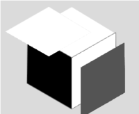
Some really simple box shapes, just shifting the faces outwards a touch.

A three-tone one, an outline one, a single colour one.

Then with some curves added to the box faces

2w1w9c4.png


same thing just on a lighter background

15gy1ip.png
 
Just when you mentioned your new [Y], I realised the dragonbox logo looks a bit like one too with the wings/tail [4th below]

2dbm92w.png
I Think the top one is the best idea. The "DragonBox" logo should be unchanging between products, so modifying the logo to look more like a Y is just modifying the logo for one product. Instead, branding a product logo (Pyra, etc) on the box is much easier to do and doesn't require you to have to change the logo for the DragonBox brand to fit each product.

-God Ginrai
 
that was an older version of the dragonbox logo though... just grabbed for the merge with Pyra text one...

This later one I preferred, has IMO a nicer tail shape, more dragon-y 

2zsty11.png


edit: I upped the wrong img :)
 
Last edited by a moderator:
Am I alone in thinking the wings look a tad too cartoon like? I really love the idea, especially the top one, but I think it would look miles better if the wings were less curved.
 
that was an older version of the dragonbox logo though... just grabbed for the merge with Pyra text one...

This later one I preferred, has IMO a nicer tail shape, more dragon-y 

edit: I upped the wrong img :)
 I don't like the tail in this picture. It looks weird.

Am I alone in thinking the wings look a tad too cartoon like? I really love the idea, especially the top one, but I think it would look miles better if the wings were less curved.
I actually like the wings like that. I think it's important for them to be exaggerated like that because they are a defining feature. Matt Groening once said "I think that memorable cartoon characters are always identifiable in silhouette." I think this is true not only for Cartoon characters, but for logos as well. Exaggerate the defining features so that your logo cannot be mistaken for anything but your product's logo.

-God Ginrai
 
Last edited by a moderator:
 
Am I alone in thinking the wings look a tad too cartoon like? I really love the idea, especially the top one, but I think it would look miles better if the wings were less curved.
I actually like the wings like that. I think it's important for them to be exaggerated like that because they area defining feature. Matt Groening once said "I think that memorable cartoon characters are always identifiable in silhouette." I think this is true not only for Cartoon characters, but for logos as well. Exaggerate the defining features so that your logo cannot be mistaken for anything but your product's logo.

-God Ginrai
Very good point.
 
I don't like any of these squares with dragon parts attached to them.  Please be careful not to follow the trend of only suggesting ideas that fit inside of the previous ideas.

Pretending I did like all of it though, I'd suggest against sticking Pyra and Dragonbox things together into the same thing.
 
that was an older version of the dragonbox logo though... just grabbed for the merge with Pyra text one...

This later one I preferred, has IMO a nicer tail shape, more dragon-y 

2zsty11.png


edit: I upped the wrong img :)
I like this. But maybe the box doesn't have to be a cube? Can the box be shaped more like a handheld? Maybe slightly opened to make a "mouth"?

Also I think it needs more contrast, dark grey on grey is not enough.
 
Back
Top