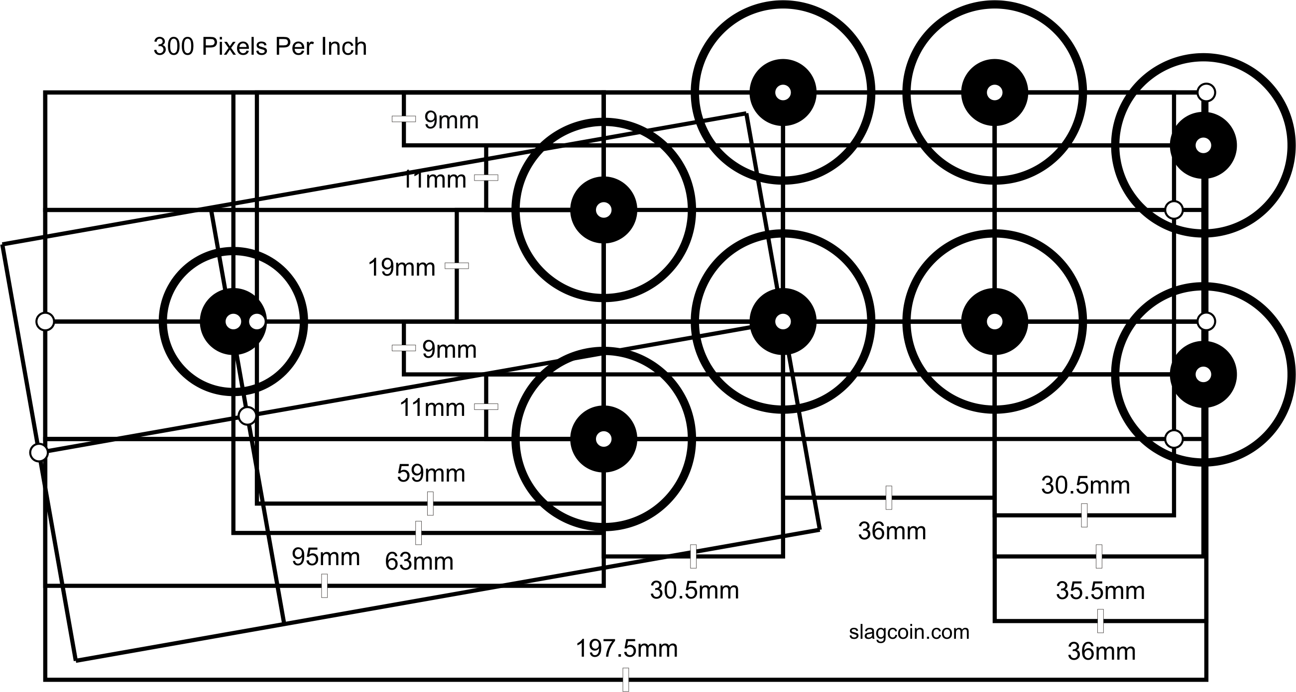
6 buttons AB/CD/XY and 4 shoulder buttons?


I played Super SF2 as a kid on my SNES a lot but as soon as I got an emulator and a pad with 6 buttons on the right side,

I finally started enjoying it way more and cannot play it different now.

Why are there so few pads of this kind and why did Saitek go back to 4 buttons?

I even mailed them, if they will produce the p2600 again or a successor, but they never answered.

Action RPGs like Soul Reaver 2 are a lot better to control this way too

and you got more buttons for camera angles etc.. in racing games, etc..

clamshell design + bigger screen = space for two more buttons
 
Last edited by a moderator:
The reason I've been trying to get more information about use cases is because I'm trying to imagine different ways of arranging the buttons that doesn't leave my thumb sore but still does what it needs to do.

Here's what I came up with:

C Y Z
A B
X
The original diamond remains exactly as is, with new C and Z buttons to the top left and right respectively (or some rotation thereof) and can be hit with the corners of your thumb. There's enough space there already that they could all remain the same size and none of the existing ones would need to be rearranged, just drill two new holes. Keep the "keyboard" layout the same (A=Home, B = End, etc...) because that's really intuitive, and the two new "corner" buttons, less frequently used, for insert and delete.But is that a setup that would work for gaming? I can see in my head how it could work in theory, but what does someone who is used to playing fighting games think?
 
C Y Z
A B
X

what does someone who is used to playing fighting games think?
I think it would be very nice for anything but fighting games.

You need a combination of 2 times 3 buttons for it.

This setup would be grand for action RPGs and space craft simulators though.
 
Last edited by a moderator:
Please no 6 Buttons. :(

They might be good for fighting games like SF but it would be very bad for Adventure Games like Zelda, Mario, etc.

Don't you think?
 
How could it be bad? If you do not need them: Ignore!
As I already explained, adding two additional buttons is not a zero cost operation. If you put them in the traditional 2x3 arrangement, the current format will need to have smaller buttons shifted over slightly at the very least, and there's also two fewer GPIO lines which would not be available to hackers. Arguably none of the ones currently available on the P1 are being used but that's not an argument to casual toss them away.Further, with two additional buttons available, you'll get developers who feel the need to use them where they didn't have to before. All this adds up to not simply being able to ignore them.
 
I think it might be worth a visual consideration... Anybody want to shop something?

Would it look good?.. would it be comfortable?... if a game used all six buttons - would it play well?
 
Last edited by a moderator:
So what are the views on this? I was following above trail of thought arriving on that solution.
Oh sorry, missed that post. That's kind of what I was envisioning except I only used the AY and BY buttons.I like it, the extra 2 (or 4) buttons can be useful for a lot of things without needing to change already learned behaviour, and they don't get in the way if they aren't used.
 
I like 6 (3 + 3) face button layout for Capcom fighting games, but unfortunately I don't think this it will work in a portable clamshell console.
 
^ I don't think Neo Geo style layout would work either..

sega2_l.png
 
I am a solid supporter of six game buttons, as well as four shoulder buttons but I think that change is already certain so I don't think I need to talk about that.  I'm not a Street Fighter player, but I love plenty of N64 games; those are what made that six button layout most familiar to me.  I think WizardStan's triangle shape arrangement looks like a bad idea though.  I see the value of less thumb movement mentioned, but that triangle creates three safe thumb positions, each controlling three buttons, while the two rows N64 arrangement has only two, each controlling four buttons.  By this I mean thumb positions from which buttons can be pressed just by rocking in a direction, without hopping over another button.  Us six button pioneers can value that tactile certainty too. 

On our current Pandora, I would value four shoulder buttons over six game buttons, because I have found O and P to comfortably substitute for them in their positions.  I would still be much happier with a N64 style set.
 
Even the current buttons are quite small. How are six going to fit? Can someone gimp a mockup?
I did a really cheesy one, but apparently I don't have any option to attach files any more
Edit:

pand6.jpg
 
Last edited by a moderator:
Tried holding my pandora in hand so that my thumb rests on two buttons (tip on A, joint on X) using that layout and it was definitely not comfortable. Tried both diagonals there. :(

EDIT: Any way the 45° layout angle of the buttons could be retained?
 
Last edited by a moderator:
Here we go

pand6a.jpg


I always hated the nubs anyway...
 
Last edited by a moderator:
Button placement wise that looks a lot better. Tried it and at least in my hands it feels comfortable. Not sure I'd sacrifice the right nub for those buttons though...
 
Back
Top