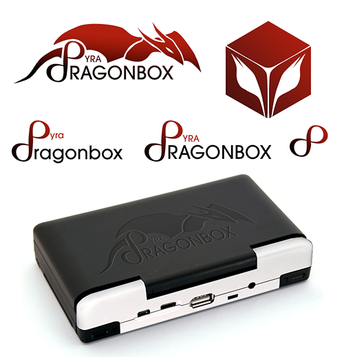
Finding a proper name and logo :)


grad4.png
Doesn't look bad, but Pyra is a Handeld pc and a games console, not a kid's toy. A lot of people wouldn't accept that thing on their umpc and if this logo would be chosen I'd put a sticker on it.

 Awesome idea!! It can be improved of course.
 
Last edited by a moderator:
Dragons are not just for kids, dragons are for awesome people.  Kids just gasp the obvious faster.  And EvilDragon and Dragobox are already EvilDragon and Dragonbox.

I personally do not want a label which is nothing but text, that's the most boring kind of graffiti.
 
 
Doesn't look bad, but Pyra is a Handeld pc and a games console, not a kid's toy. A lot of people wouldn't accept that thing on their umpc [citation needed] and if this logo would be chosen I'd put a sticker on it.
I guess there will be a poll at some point where we'll discuss which logo fits best. 
 
Yes, but till then please make as many variants as possible, every try is appreciated. The more choice the better.
 
Doesn't look bad, but Pyra is a Handeld pc and a games console, not a kid's toy. A lot of people wouldn't accept that thing on their umpc and if this logo would be chosen I'd put a sticker on it.
Kind of agree. The image of the case is just gratuitous more than anything else. :lol: I didn't really expect people to like it as much.

I considered mentioning it didn't look as professional, but didn't want to affect original opinions before hearing them. I expected that viewpoint as I experienced something similar when freelancing for my gov't several years ago and divided the opinion amongst different demographics (mostly age related at the time). Never forgot that and kept it in mind.

For me the evolution is left to right + down the next line to the infinity symbol. So a device with just that symbol on the top would be prime for me personally. Studied design in school, which always leaned more towards swiss minimalist, so I see it as the best design being one that takes away as much as possible while sending the same message, but it's always worth dreaming big to start and cutting away later.
 
^ I disagree with Kiga, I think the Logo looks awesome.
 
Dragons are not just for kids, dragons are for awesome people.  Kids just gasp the obvious faster.  And EvilDragon and Dragobox are already EvilDragon and Dragonbox.

I personally do not want a label which is nothing but text, that's the most boring kind of graffiti.
It's not a matter of dragons but that logo on top of Pyra will make it look like a cheap toy. And as a standard logo it looks like an MMORPG website banner :lol:

@DFP, I see, the infinit symbole is good to me, put the problem is that in the main logo, "dragonbox" is too big compared to "Pyra" wich is the main name.
 
Last edited by a moderator:
Predicting an incoming 'Pyra-chan'.

More random:

grad4.png


I'm still partial to the first design I posted that was derived from the Pandora icon though.
To be honest, when I first saw this, I thought it was a rat or mouse (for 2 seconds or so). That's probably because of the tail and overall shape, and because I tend to look at things left-to-right. It is not clear what the cube is supposed to represent. The text logo only works in lowercase, in uppercase it looks like PYRA dRAGONBOX. I would put the "DragonBox" first and the device name second. The infinity symbol on its own is not sufficiently unique, and people will probably wonder what this "8" is supposed to mean (does it run Windows 8? ;) ).

I don't mean to be negative, it's just my honest and hopefully constructive feedback. I like the general idea, and it's a good start. Keep going! (I like ambigrams more though)
 
You could make the Dragon chest area a box.  :lol:
The reason I think this label is great is because it has an actual dragon.  The word already says Dragonbox, come on the dragon doesn't have to be a box.
 
The reason I think this label is great is because it has an actual dragon.  The word already says Dragonbox, come on the dragon doesn't have to be a box.
That was for the people saying writing out the whole thing is too much. Take too much room.
 
Last edited by a moderator:
If someone is interested, and subsequently ask, because its not written in plaintext, that is a much more deeply rooted sales pitch than just seeing a logo.

Im not assuming about what that conversation entails, just that human relation is better than unpersonal encounters.

My personal view is that writing the distributor name and model in plaintext is vulgar. If at best the font is nice, then im still of the opinion that text is ugly(ier than a pure visual approach)

For much of the same reason a visually stunning design is appealing to the ones who know what it is, i think it will be alluring to those who dont.
 
Maybe like that:

kyy7.png


 I changed letter's ends, they are now pointed. I think we have to improve end's shape.
 
Last edited by a moderator:
Batman: We are changing Pyra to Batman.

EvilDragon: You can't just change... Wait, how did you do that?

Batman: I'm Batman!
 
Last edited by a moderator:
Predicting an incoming 'Pyra-chan'.

More random:

grad4.png


I'm still partial to the first design I posted that was derived from the Pandora icon though.
To be honest, when I first saw this, I thought it was a rat or mouse (for 2 seconds or so). That's probably because of the tail and overall shape, and because I tend to look at things left-to-right. It is not clear what the cube is supposed to represent. The text logo only works in lowercase, in uppercase it looks like PYRA dRAGONBOX. I would put the "DragonBox" first and the device name second. The infinity symbol on its own is not sufficiently unique, and people will probably wonder what this "8" is supposed to mean (does it run Windows 8? ;) ).

I don't mean to be negative, it's just my honest and hopefully constructive feedback. I like the general idea, and it's a good start. Keep going! (I like ambigrams more though)
I already told how to fix this.

Make the P a standalone P and add a D to the Dragonbox.
 
Back
Top