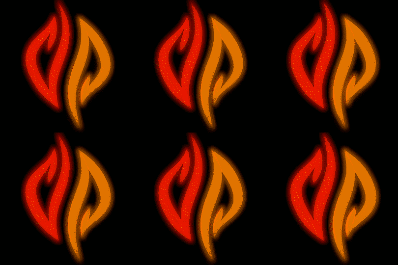
The Pyra-Logo


BTW @x1212, you may want to use WebM instead of GIF. It will allow you to get a larger image/better quality with a smaller file size. 
Thanks, now I have full quallity at ca. 1/2 the filesize of the 16 Color ones :)

... but I'm not permitted to upload that kind of file ... :(

Ok :D

post-7796-0-02969600-1398943787.gif
post-7796-0-96741100-1398943675.gif
Now to get crazy. Burning and spinning. :p
As soon as I get a higher quality burning effect ;)

current state:

post-7796-0-24284700-1399106251.gif


I'm trying to get a small "base-flickering" (needs to be really small), as soon as I'm satisfied with it I will try multiplying it with some sporadic peaks, in order to get the effect of a little bit of wind ... don't know if that will work out.

If that is not enough to give the desired effect I might look into animating the the shape of the logo as well (currently all I do is animating the thickness of the "lines"/shape not the curves themselves).
screen1_1.png

I think it might look cool to have something that starts out as a single flame with red and orange, then transitions to the logo.  This was inspired by "flamy" logo2.  I was thinking a slowly flickering flame, then it can rotate or whatever (maybe the colors just move away from each other) and becomes the logo.  I don't think I am describing what I imagine well enough.
Maybe you can paint something that could help to imagine what you mean ... or a link to something that is close to it?

Edit: had a look at that version and I think I have a rough idea what you mean but not sure ... if it is what I think it is, then it would be pretty hard ... did you mean something that looks like a real flame and then becomes the logo while spinning?

Tenka, this is about the boot animation, not the LEDs. 
Oops.  Yes that makes more sense now.  But darn, this would be really really cool on the back of a black lid too.
Please don't give me such ideas ... it's gonna be expensive if I want to get a case-mod like that :p

post-7796-0-94509700-1399105383.png


post-7796-0-14423000-1399105547.png


untitled2.png

untitled3_2.png

flamy_pyra_logo4_16c.gif

screen1_1.png
 
Last edited by a moderator:
rygD, on 02 May 2014 - 4:12 PM, said: I think it might look cool to have something that starts out as a single flame with red and orange, then transitions to the logo.  This was inspired by "flamy" logo2.  I was thinking a slowly flickering flame, then it can rotate or whatever (maybe the colors just move away from each other) and becomes the logo.  I don't think I am describing what I imagine well enough.   Maybe you can paint something that could help to imagine what you mean ... or a link to something that is close to it?   Edit: had a look at that version and I think I have a rough idea what you mean but not sure ... if it is what I think it is, then it would be pretty hard ... did you mean something that looks like a real flame and then becomes the logo while spinning?
Something like that.  The initial form of the animation can be as simple as overlaying variations of the 2 halves of the logo and have them kinda flickering, as in your base flicker example, with an occasional gust/flare (to make it obvious it is a drawing of a flame). The transition can be anything from the halves splitting apart, moving slightly left and right (what I imagine, and what might be simplest), or spinning into the logo, or even a big spark/explosion, or whatever you call it, that dies down to reveal the logo, perhaps with your base flicker.  I think it would be best to keep it fairly simple so it doesn't make people wonder what the hell is going on with it.

I might try to find a way to draw it on my Pandora, as it isn't really something I know how to make with normal computer input. 

I have no clue why my quote got trashed.
 
Last edited by a moderator:

First try to create stickers to put on the french OP flyers during events in May, June and July.

Flyer size is 4.5 cm x 7.5 cm.

Original size:

4_5_x_7_5.png

2x size:

4_5_x_7_5_2x.png

Comments are welcome.
 
Last edited by a moderator:

Nice work and idea fantomid.

I'd say add some space between the bottom of 'PYRA' and the line of text... It looks too close.

That below text could probably be made a smaller font size to create the space.

Also, not sure if the actual official style is all UPPERCASE.

I think it's Pyra rather than PYRA.

...As shown up top on these boards and the official site.

And, any reason to link to the blog page of the site rather than the homepage?
 
Last edited by a moderator:

Perhaps by justifying the 'Dragonbox' and 'Pyra' towards the top of the logo you'd get the extra space you need.

I also tend to think 'Successor of the Pandora' should be more of a side note.  Perhaps shrink it slightly to it could also fit right of the logo, or event to the right if the tail of the 'y' like on the offical site, if you can find a way to stop it spilling off the right of the paper.
 
What Levi said.

Looks better though.

Another thing, and not saying that is wrong, but I tend to use "on" for "something is 'on' the telly".

For webs, I always say "at", like "follow the development 'at' http://www.com"
 
Also, not sure if the actual official style is all UPPERCASE.

I think it's Pyra rather than PYRA.

...As shown up top on these boards and the official site.
I don't think there is an actual official style already. The logo on these boards is a stub and the official site is also temporary.

I like these options most:

- DragonBox Pyra

- dragonbox PYRA
 
I really don't like all lower-case for DragonBox.

As for Pyra vs PYRA I think the best option will depend on the font selection, and which version looks better in that font

- Neelix
 
I really don't like all lower-case for DragonBox.
Me neither if it's in a running text, but if it's in a logo, things are different and different rules apply.

Compare for example this:

DragonBox
Pyra
with this:

 ​
dragonbox
PYRA
and I would say that the latter looks better than the former.
 
hmm ... might be me being used to camel-case from programming (and starting a lot of words upper-case because of my mother-language being German), but I somehow like the former better than the latter.
 
What Levi said. Looks better though.
Will work this evening on the last version with your corrections.

Another thing, and not saying that is wrong, but I tend to use "on" for "something is 'on' the telly". For webs, I always say "at", like "follow the development 'at' http://www.com"
Like most of French people, my english is not always as good as I would like.
 
Last edited by a moderator:

Yeah no problem fantomid :)

I was just pointing that out as it seemed a little strange to me personally, but not sure that is even the correct English or even if there is a correct grammatical way of saying a URL?

Still, your English is a lot better than my French, oui
 
Yep.

Needs a poll for sure.

"Dragonbox Pyra"


dnzihe.png


Though I do like those smallUPPERCASE styles of some fonts.

So ED, when can we vote on some typeface options anyway, to accompany the nice new logo? :)
 
Yep.

Needs a poll for sure.

"Dragonbox Pyra"


dnzihe.png


Though I do like those smallUPPERCASE styles of some fonts.

So ED, when can we vote on some typeface options anyway, to accompany the nice new logo? :)
looks nice but the 'g' in Dragonbox is hard to read ... maybe the lower part of it should be more like the 'y'?
 
Back
Top