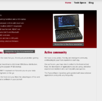
Basic website


I'll go ahead and say I don't think I've ever seen a colour gradient look good in anything but certain logos. I really quite like Klumpens and FZERO's attempt, although the latter could do with a higher concentration of data, as already mentioned.
 
Dense text and unusual colours tend to scare people away...
Low density text in excessively large fonts puts me off reading the whole page. I really dislike scrolling through pagefuls of space to read a few sentences.

Also consider that the kind of person who wanders around the internet looking for obscure, expensive, hackable, portable devices is probably of a higher intellectual standing than the average iSheep.

That design has some great aspects, but I have to press Ctrl+- a few times to make it readable.
 
Last edited by a moderator:
I would suggest remove the Pandora background and maybe do a very small "white shining" around it to get some contrast. The white background around the Pandora looks a bit like "copied from paint with transpery".
 
I've created another blog that shows the last 5 Blog Posts to choose from.

Can be included e.g. besides the main blog entry :)

Code:
<script type='text/javascript' src='http://boards.openpandora.org/external.php?id=12&amp;k=73c45bc9b29cb54de0a22e263efaf448&amp;method=div' id='block-73c45bc9b29cb54de0a22e263efaf448'></script>
 
I would suggest remove the Pandora background and maybe do a very small "white shining" around it to get some contrast. The white background around the Pandora looks a bit like "copied from paint with transpery".
Of course. But it would be even better if we didn't have to show a Pandora ;)
 
Too light.

I didn't even notice.

I'd like to have it as the background of the "Subscribe to Pyra newsletter" textbox.
Believe it or not, but that popup textbox has exactly the same background color as the rest of the website. It may look darker than it is though because it is surrounded with a pure white border. Fixed that border and some of the other remarks above:

http://people.cs.kuleuven.be/~jon.sneyers/tmp/pyra3/
Believe it or not, but not for me.

I quickly made a hardcopy of my Screen, cut the Textbox and placed it over the background.

It's different.

EDIT:

Picture is in Attachments as it somehow doesn't show up.

Website.png
 
Last edited by a moderator:
_wb_ was referring to the background of the popup window that appears when you click that link, rather than the background colour of the link itself.  I thought that's what you were referring to too for that matter.

To be honest I don't think the background needs to be any darker.   Changing to that light grey was enough to kill the glare,  and I think it goes nicely with the red gradient in the box.

- Neelix
 
Yes, I thought you meant the color of the popup window, not the button itself :)

The button color itself is way too dark to be used as a general background color in my opinion. Here's what you get if you do that: http://people.cs.kuleuven.be/~jon.sneyers/tmp/pyra3-askarus/

You would have to use bright text if the background gets that dark, like this: http://people.cs.kuleuven.be/~jon.sneyers/tmp/pyra3-askarus2/

I still prefer a light background like in http://people.cs.kuleuven.be/~jon.sneyers/tmp/pyra3/

I don't know why, but to me, websites with dark backgrounds look like they're from the nineties, in a bad way.
 
Maybe you understand now why I want a gray background.

Look how my Firefox looks.

I'm using a special theme to have everything as white letters and gray background.

It's so much more eye friendly for me and looks so much better.

If you all prefer white, then go for it.

Bildschirmfoto - 21.01.2014 - 08:50:39.png
 
Would it be unhelpful to suggest turning your screen brightness down if the white is glarey?

My recentish Samsung monitor is comfortably readable at brightness = 0, even with small text.
 
Would it be unhelpful to suggest turning your screen brightness down if the white is glarey?

My recentish Samsung monitor is comfortably readable at brightness = 0, even with small text.
No chance.

Still a lot to bright for me.

Also I simply like gray better.

All my presentations at university have geay background and white letters.
 
Well it is easy enough to make several CSS stylesheets so you can choose your theme :)

But if you don't like white backgrounds, the internet must be pretty disappointing for you. Google, Wikipedia, this forum, etc etc, nearly all sites I use daily have a white background.
 
edit: The css swapping is best way

Askarus, what's that thing you use in FF there? Does it change all the sites you visit then? It sounds pretty good
 
Last edited by a moderator:
Well it is easy enough to make several CSS stylesheets so you can choose your theme :)
Better not.

Single color is better.

But if you don't like white backgrounds, the internet must be pretty disappointing for you. Google, Wikipedia, this forum, etc etc, nearly all sites I use daily have a white background.
It is, really.

And this bright background hurts my eyes.

Askarus, what's that thing you use in FF there? Does it change all the sites you visit then? It sounds pretty good
For me it's one of the best FireFox Addons.

You may put any colors you like on every website.

There are some minor problems like you can't see some pictures as they are only black squares.

I have it in my add-on bar and can disable it with 2 clicks if a page is messed up a lot.

But I got used to it and it's so much more eye friendly and beautiful :) .

http://userstyles.org/styles/2187/myfavolours-global-custom-color-scheme
 
Back
Top